Where's My Order? Stop Making Users Guess: Order Tracking and Delivery Status for Your Vibe Project
The hardest part of an order is the wait: a page that only says 'Shipped' tells users nothing about where their goods are or when they will arrive. This guide covers five steps, three things on the first screen, saying it first when something goes wrong, one source of truth, and how to write the expected time. All example projects, people, and numbers in this guide are fictional.
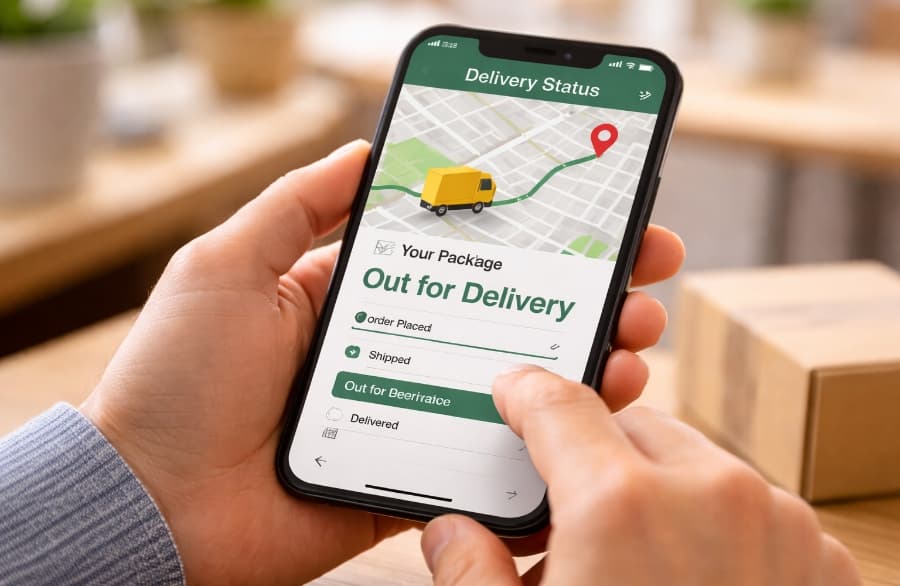
On a Friday evening, Xiao Man ordered a box of lychees from "FreshBasket" as a birthday gift for her mother, with a note: "Deliver Sunday morning, Mum will be home." She paid, the page jumped back to the home screen, and the order status read "Order placed." On Saturday morning she opened the order and saw a single line: "Shipped." Where was the fruit? Would it arrive by Sunday? She had no idea. At noon on Saturday she checked again. Still "Shipped" — not a single word had changed. She messaged customer support to ask where her lychees were; three hours later came the reply: "It's on its way, please be patient." On Sunday morning her mother called to ask where the lychees were, and all Xiao Man could say was "they should be on their way." The box arrived on Monday afternoon. Her mother's birthday was already over. Xiao Man did not blame the delivery for being slow — lychees take two days from the orchard to her mother's door, and she could live with a day late. What she blamed was this: from paying on Friday to receiving on Monday, three whole days, not one person and not one page told her where the goods were, where they were headed next, or when they would arrive.
Two things first. First, everything in this guide's walkthrough — the project "FreshBasket," the operator "A-Nan," the user "Xiao Man," and all times and quantities — is fictional, invented only to make the flow clear. Second, the boundaries: this site has already published several neighbouring guides — the checkout flow guide is about how to place an order and pay, a "before buying" question; the invoice and receipt guide is about payment proof, a "proof of payment" question; the in-app notification guide is about how messages reach users; the support ticket guide is about what happens after something goes wrong. This guide repeats none of those. It covers one thing only — the stretch between placing an order and receiving it, and how the page should tell a waiting user where their goods are. Checkout is about "you can buy it," invoices are about "you have proof," and the tracking page is about "you can wait without guessing." Different jobs.

1. First, the reality: users are not afraid of slow, they are afraid of not knowing
When teams hear "delivery complaints," their first instinct is to chase the courier, assuming that if the goods just arrive faster, users will stop worrying. That is only half right: however fast the delivery, it does not change the fact that the user knows nothing while waiting. The money has left their account, the goods have not reached their hands, and that gap is when users feel least secure. What they actually fear is not "it arrives tomorrow instead of today" but "I have no idea whether it arrives tomorrow or the day after, my mum's birthday is Sunday, and I don't know whether to order a second box as a backup." What Xiao Man regretted most was not that the lychees were a day late, but that on Saturday she had a real chance to order a local box as a rescue — and one line, "Shipped," kept her from acting. She did not know whether to act, so she did nothing.
The fictional example numbers in this guide are: out of 100 people who place an order, 86 check the tracking at least once, 71 check within 24 hours of the "Shipped" status, 58 understand what the current step means, and 41 stop asking support about it after reading the page. These numbers are fictional, and they make one point: the tracking page is a funnel, and every step loses people. Only 86 out of 100 even look, so the page must first solve "can users find it"; 71 check within a day of shipping, so it must also solve "is there anything new at the moment users are most anxious"; in the end only 41 stop asking support, so it must solve "do users feel reassured after reading." Any step done sloppily leaks users at exactly that step.
Here is a second fictional comparison: without a clear tracking page, 100 orders produce 34 "where is my order?" support chats; with the tracking page written clearly, 100 orders produce only 9. These numbers are fictional too — the point is not 34 and 9 themselves, but that how clearly the page is written decides whether support has to answer the question the page should have answered. Say it clearly on the page and users stop asking; leave it unsaid and users have no choice but to ask support, who then repeats the very sentence that should have been on the page. The first rule of tracking pages is this simple: a tracking page is not written for the courier, it is written for the person waiting — and the waiting person only wants three things: where is it, what happens next, and when will it arrive.
2. Five steps are enough: do not dump the courier's internal process on the page
The most common fault of tracking pages is too many steps. The raw data from the courier may hold a dozen or more records for one parcel: collected, arrived at sorting centre, left sorting centre, arrived at transit hub, left transit hub, arrived at delivery station, picked up by courier — and more. Dumped on the page, users see a list of place names and times and get more confused the longer they look. Users are not dispatchers. They do not need to know how many sorting centres a parcel passed through; they need to know which step it has reached. The fix: fold a dozen raw records into five steps users can understand — Order placed, Packed, Shipped, Out for delivery, Delivered. One sentence per step, never two lines.
How the five steps are worded matters too. "Order placed" means "we have your order." "Packed" means "the goods are boxed and waiting for the courier." "Shipped" means "the parcel is on its way." "Out for delivery" means "it will reach you today." "Delivered" means "it has arrived." Under each step put a single time — when that step happened — not three times piled together (order time, packing time, shipping time all stacked up). Do not delete the courier's raw records; tuck them under a "View full tracking details" link, so users who want them can open them and users who don't just see the five steps. The page shows the conclusion by default and leaves the detail to whoever asks for it.
The steps also need a line connecting them: finished steps get a tick, the step in progress is highlighted, and steps not yet reached are greyed out. One glance tells the user "three done, two to go" without reading timestamps line by line. The worst version is five steps all in one colour with no order — users have to read every timestamp and work out for themselves how far the parcel has got, which is handing the arithmetic to the user. Steps exist to show users the progress, not to archive the courier's records.
3. Three things on the first screen: where it is, what happens next, and when it arrives
When a user opens the tracking page, the first screen must answer three things. Miss one, and the user goes to support.
First, where is it: say it in one sentence, and do not stop at the word "Shipped." "Shipped" only says the parcel is no longer in the warehouse; it says nothing about where it is. A good version reads: "Your parcel is travelling from the orchard region to your city; the next stop is the local delivery station." Users want a sense of place, not three words. Second, what happens next: tell users what will happen and whether they need to do anything. "The courier will call you tomorrow morning, please keep your phone on" tells them to expect a call; "You don't need to do anything, you'll get a text when it arrives" tells them they can stop watching. Third, when it arrives: give a time window, not a fake promise precise to the hour. "Expected Sunday morning" is more honest than "Expected 9 November, 10:00" — once an hour-precise number is wrong, users remember "you lied to me"; once a window is wrong, users remember "roughly that time."
The easiest of the three to forget is the update time. The page should carry one small line: "Tracking updated today at 09:24." With that line, users know the information is from this morning, not three days ago. Without it, users look at "Shipped" and wonder whether this is yesterday's status or today's — and then ask support anyway. The update time is the tracking page's shelf life; without a shelf life, users dare not trust it.
4. Say it first when something goes wrong: do not wait for users to ask why their parcel stopped moving
The scariest thing in delivery is not slowness, it is a parcel that stops moving. A parcel sits at one step for two days, the user opens the page once a day, sees the same status every day, and on the third day they will contact support — or cancel the order. The first rule of exceptions is: you say it first; do not wait for the user to ask. When the system sees a parcel with no new record for more than 24 hours, it should push a message on its own: "Your parcel spent an extra day at the transit hub; delivery will be a day late, the new expected time is Tuesday." A user who gets that message has their answer and will not ask support; a user who never gets it will ask on day three, and by then they will be angry.
An exception message needs three parts, and none can be skipped. First, say what happened: "The parcel was held at the transit hub for a day" — not just "delivery exception," which only says something went wrong without saying what. Second, say what it means for the user: "Delivery will be a day late" — do not make users guess whether it is one day or three. Third, say whether the user needs to do anything: "You don't need to do anything, we will keep following it" or "Please check whether the delivery address is correct." The fictional example numbers in this guide are: out of 100 orders, 6 hit an exception, 4 of them were resolved by a proactive push alone, and only 2 needed a human. These numbers are fictional; the point is "say it first, and fewer orders need a human" — for most exceptions, users only want an explanation, not a person.
One exception is easy to miss entirely: a wrong address. The user typed "Building 3, Unit 2" as "Building 3, Unit 2" with a wrong character, the courier cannot find the door, and the parcel goes back to the warehouse. The moment the system receives a "delivery failed" record, it should push a message asking the user to correct the address, with a link that opens the address form directly — not a loop where the user finds support, support passes it to the warehouse, and the warehouse changes it three days later while the parcel sits there. A wrong address is not the user's fault — the form should have helped them write it correctly — but the way to fix it must be within the user's reach.
5. One source of truth: do not show three versions in three places
The easiest place for tracking information to go wrong is having too many entrances. The order page says "Out for delivery," the text message says "Shipped," and support says "It's on its way" — three places, three versions, and users do not know which to believe. The fix is: one data source, and every entrance reads the same status. The order page, texts, emails, and the support console all read from the same tracking-status source. Do not let the text template keep its own set of statuses, or the support console store another set. There is one status; the wording can differ, but "which step has it reached" must be identical everywhere.
The entrances themselves must be easy to find. Users check tracking through two entrances that actually matter: in the order list, each order should show its current status and expected time directly, without making users open the order detail and scroll to the tracking section; and on the order detail page, the tracking card belongs at the top, not buried at the bottom. Links in texts and emails should open the tracking page in one tap — not jump to the home page, ask users to sign in, and then make them find the order. Users tapping those links are already anxious; every extra step loses a share of them. The worst version is a text that only says "Your parcel has shipped" with no link at all — users get the text, then have to open the app, find the order, and open the detail page themselves. That text helped nobody.
6. How to write the expected time: give a window, keep it updated, never fake a promise
The expected delivery time is the easiest line on the tracking page to break trust with. Write it too precisely and a miss is a broken promise; write it too vaguely and users learn nothing. The fix is a window, with the width stated honestly. "Expected Sunday to Monday" is a window users can accept; "Expected 9 November, 10:00" is fake precision users cannot accept — the product does not know what hour the delivery van will arrive, so writing it down is pretending to know. But do not make the window too wide either: "Expected in 3 to 7 days" says nothing, and users still do not know whether it arrives by Sunday.
The fictional example numbers in this guide are: with the expected time written as a window with one day of slack on each side, 82 out of 100 orders land inside the window. These numbers are fictional; the point is "a window needs a stated width, and it must genuinely hold most orders" — too narrow a window and half of ten orders run late, so users stop believing it; too wide a window and users feel you never calculated it at all. The expected time must also move with the status: once the parcel reaches the delivery station, narrow the window to "Arriving today"; once it hits an exception, change it to the new time immediately and say why it changed. The worst version is an expected time that is written once and never updated — the parcel is already two days late and the page still says "Expected yesterday." An expired promise on the page is worse than no expected time at all.
7. After delivery: signing for it is not the end, it is the start of the next stretch
Many teams think the tracking page's job is done once the goods arrive. It is not: after delivery there are three things left, and handled badly they cost you the next order. First, confirm receipt: when the goods arrive, users should see "Delivered" at a glance, with a "Confirm receipt" button — do not make them guess whether this counts as delivered. Second, an after-sales entrance for problems: the goods arrived, but two lychees are spoiled, and what the user needs is "Apply for after-sales," not another round with support. Put "Something wrong? Apply for after-sales" right on the delivered page, so users can take a photo, write the reason, and submit in one go, instead of finding the order, finding support, and describing the problem from scratch. Third, a review entrance: the moment right after delivery, when users are happiest with the goods, is when they are most willing to write a couple of lines. A gentle reminder within 24 hours of delivery — "Did the goods arrive? Are you happy with them?" — works far better than asking a week later, when users have long forgotten what the lychees looked like.
One more detail: say clearly when someone else signs for it. If the parcel is in a pickup locker, at the gatehouse, or with a neighbour, the page should read "Left in the community locker, pickup code 4821" — not just "Delivered." Users who come home and see no parcel will first think "it was lost" and then contact support. Pickup code, locker location, and the name of the person who signed — write all three clearly, and users can collect the parcel themselves without asking anyone.
8. Pre-launch checklist
Tick every item on this list before shipping any order-tracking feature. First, steps: five are enough — Order placed, Packed, Shipped, Out for delivery, Delivered; fold the courier's dozen raw records under "View full tracking details" and show only the conclusion by default; finished steps ticked, the current step highlighted, future steps greyed out, so one glance shows how far it has come and how far is left. Second, the first screen answers three things: where it is ("Your parcel is travelling from the orchard region to your city; the next stop is the local delivery station"), what happens next ("The courier will call you tomorrow morning, please keep your phone on" or "You don't need to do anything"), and when it arrives (a window, never a fake promise precise to the hour); plus one small line, "Tracking updated today at 09:24," so users know this is not three-day-old status. Third, exceptions first: if a parcel has no new record for more than 24 hours, push a message that says what happened, what it means for the user, and whether the user needs to do anything; in the fictional example, 6 out of 100 orders hit an exception and 4 were resolved by a proactive push alone; when an address is wrong, push a correction message at once with a link straight to the address form. Fourth, one source of truth: the order page, texts, emails, and support console all read the same status; show the current status and expected time directly under each order in the order list, and make links in texts open the tracking page in one tap. Fifth, expected time: write it as a window with one day of slack on each side (fictional example: 82 out of 100 orders land inside the window); narrow it to "Arriving today" once the parcel reaches the delivery station, change it at once when an exception hits and say why, and never leave an expired expected time on the page. Sixth, after delivery: a "Confirm receipt" button on the delivered page, a "Something wrong? Apply for after-sales" entrance, a gentle review reminder within 24 hours, and for parcels signed by someone else, the pickup code, locker location, and the signer's name — never just "Delivered."
Six pitfalls, once more. First, do not dump the courier's dozen raw records on the page: users are not dispatchers, they only need five steps. Second, do not stop at the three words "Shipped": they only say the parcel is no longer in the warehouse, not where it is. Third, do not wait for users to ask about exceptions: a parcel that has not moved for two days will bring an angry question on day three. Fourth, do not write three versions in three places: the order page, the text, and support must agree, reading one data source. Fifth, do not write a fake promise precise to the hour: once a precise number is wrong, users remember "you lied to me." Sixth, do not walk away once the goods arrive: confirming receipt, after-sales, review reminders, and pickup details are four more things waiting after delivery.

Back to Xiao Man. She still uses FreshBasket — not because it has never been late again, but because it was late again last month: the longans she ordered for her mother showed, on Saturday morning, "Your parcel spent an extra day at the transit hub; delivery will be a day late, the new expected time is Tuesday. You don't need to do anything, we will keep following it," with five steps below, the third one highlighted, and a small line beside it reading "Tracking updated today at 08:15." She glanced at it, called her mother, and said: "The longans will be a day late, arriving Tuesday — I'll pick them up on Tuesday." The whole thing cost her one decision. No support chat, no guessing where the parcel was, no second box ordered on Saturday as a backup. That is what a tracking page is for: sooner or later a user will wait for a parcel in your app, and while they wait, the product's job is not to chase the courier, not to fob them off with "Shipped," and not to make them open the page every day to see the same three words — it is to say clearly where the goods are, what happens next, and when they will arrive, so users understand at a glance, feel reassured, and get on with their day as if the parcel will arrive on time.
Comments (0)
Related articles

The main thread has to draw the page and do the accounts, so it freezes the moment the work gets heavy. A worker is another thread in another global context, and the two sides talk only through messages. Following MDN's Using Web Workers and Worker docs: new Worker, postMessage and onmessage, structured-clone copying, what a worker can and cannot do, onerror and terminate(), SharedWorker, and transferable zero-copy — with a 100-mistake breakdown from a fictional cafe order page.

setTimeout handles once, setInterval handles repeatedly — but delay only promises "at least this long": 0 is not immediate, background tabs run even later, and anything over 2147483647 overflows. Following MDN's setTimeout and setInterval docs: async return, argument passing, the delay rules, the 4 ms nesting clamp, clearTimeout and clearInterval, recursive setTimeout, lost this, and string arguments — with a 100-mistake breakdown from a fictional cafe order page.

An array has to be computed all at once; a generator hands out one value at a time, only when asked. Following MDN's Iterators and generators, function*, and Generator docs: the next() protocol, function* and yield, for...of consumption, Symbol.iterator, yield* delegation, sending values in with next(x), throw() and return(), and when to use a generator at all — with a 100-mistake breakdown from a fictional cafe order page.