Watch Five People Use It Before You Ship: Usability Testing for Vibe Projects
Users saying they like your product is not validation. This guide shows solo teams how to run a five-person usability test: scenario tasks, think-aloud, no helping, severity grading, and a one-week rollout plan.
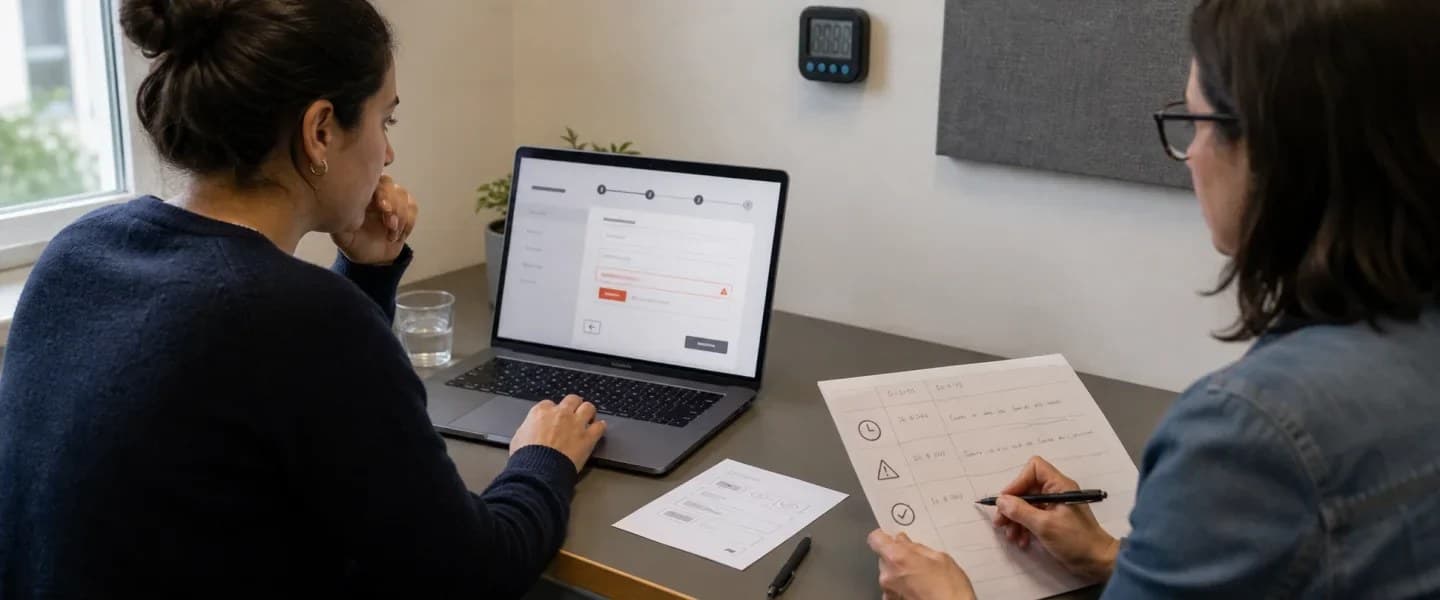
All people and products in the examples below are fictional.
First, the verdict: interviews ask about attitudes, tests watch behavior
A solo team's most common self-deception is treating "asked users" as "validated the product." In interviews, users say "I would definitely use this feature" and then never touch it after launch; in surveys, eighty percent say "the interface is clear," yet when asked to operate it themselves they get stuck on step one. Users are not lying. These are two different kinds of information: people predict their own future behavior very badly, but their present behavior is brutally honest. Interviews capture attitudes; tests capture behavior — and products ultimately live or die on behavior.
So my verdict is this: the most valuable day before launch is not spent adding one more feature. It is spent inviting five people in, sitting beside them, watching them use your product, and giving no hints and no explanations. If three out of five get stuck in the same place, that place is broken, and no further debate is needed. The value of testing is not a large sample; it is witnessing the stuck moment with your own eyes: the hovering mouse, the hesitation, the wrong tap, the step back, the sigh. No analytics report will ever show you those moments, but in a test you see them instantly.
Scope first, so this does not repeat existing guides on the site: the user interview guide covers how to ask for real needs; the A/B testing guide covers comparing two options with data; the feedback loop guide covers collecting opinions continuously after launch. This guide repeats none of those. It covers one pre-launch qualitative method: give users concrete tasks, watch what they do, and fix by severity. It does not cover survey design or data analysis — only the act of watching people use the product.
The running fictional example: Zhou Ye organizes a running club and built a sign-up mini-app called "Morning Light Run Club" with AI, and wants to test the sign-up flow before the next group run. Every person and number is invented and exists only to explain the method.
Step one: what to test? Only the main flow, only three to five tasks
The first step of testing is not recruiting; it is choosing tasks. The filter for the list has exactly one criterion: if this flow breaks, can the user still achieve today's goal? Signing up, paying, changing the date, finding the meeting point — these count. Changing an avatar, editing a nickname, browsing old photos — these do not. Zhou Ye's first test listed just four tasks: find this Saturday's run and sign up, sign up an extra spot for a friend, move Saturday's booking to Sunday, and find the meeting point after signing up. Once those four are done, the life and death of the sign-up flow has been tested.
Tasks must be written as scenarios, not as instructions. Write "Sign up an extra spot for a friend," not "Tap the plus icon in the top-right corner, then tap confirm." The first tests whether users can find their own way; the second tests whether they can follow a read-aloud manual. Scenarios should give motivation, not a route: the motivation is real, the route is what is being verified. Order tasks the way users encounter them in real life, not by feature module — real life is sequential.
One more limit: never more than five tasks per session. Beyond five, data quality falls off a cliff: users get tired, start clicking randomly, and just want it over with. Three tasks tested deeply beat ten tasks tested thinly. Features you cannot fit go to the next round. That is not laziness; it is honesty about the data.
Step two: recruit five people — no friends, no experts
Is five people enough? For the goal of finding "where people get stuck," yes. This is a rule of thumb: a serious problem will trip at least one or two out of five; by the fifth person, new problems have mostly dried up. A solo team cannot run a twenty-person study and does not need to. Fix the top three problems five people found, and the product is already much more usable than before the test. Chasing sample size is a data team's job; finding problems is a product team's job.
Who you recruit matters more than how many. First, no acquaintances: friends, colleagues and family will be polite, will cover for you, and will say "it's actually fine." Second, no experts: skilled users route around pitfalls on their own, while your real users will not. Third, recruit the actual target users: to test run-club sign-ups, recruit people who actually run and sign up for runs, not friends who never run. Zhou Ye's first testers were ordinary members of the running group, not friends from product circles.
Pay them, but not so much that they dare not speak honestly. A coffee or a small red envelope works. What matters is the opening line, said clearly: we are testing the product, not testing you; if you get stuck, it is the product's fault, not yours; the more you get stuck and complain, the more you help us. That line is not politeness — it directly determines whether testers dare to show confusion in front of you. Without it, testers try hard to look smart, and you will learn nothing.
Step three: the facilitator does exactly three things — assign, ask aloud, do not help
On test day, the facilitator's job list has three items. First, hand out tasks one at a time, next only after the previous is done. Second, ask the user to think aloud: say whatever comes to mind, for example "I thought tapping here would sign me up" or "I can't read this word." Think-aloud is the soul of testing: without it you see only that someone got stuck, never why. Third, do not help. When users tap wrong, do not correct them; when they ask "should I tap here," do not answer — just say "what do you think? Go with your instinct."
The third item is the hardest. Watching someone misuse your product, the first impulse is to explain, defend, or reach over and tap it yourself. But every rescue destroys a data point: you will never know whether the user could have recovered alone. The correct posture is to write it down: what time, on which screen, stuck because of what, and the user's exact words. Exact words matter most — in a report, "I thought the sign-up button was below" persuades more than any summary.
Split the roles. One person facilitates, one person takes notes; never make the facilitator both ask questions and take notes, or both jobs suffer. Prepare the note sheet in advance with four columns: task, completed or not, where they got stuck, user's exact words. Organize notes the same day the test runs; by next week, memory will have sanded the details smooth. Screen recording may run, but only with consent, and only to re-check details afterward — never as a replacement for live notes. Live feelings — the sigh, the hesitation, the laugh — may not survive in a recording, so they belong in the notes.
Step four: grade problems by severity, not by frequency
The most common misreading of test results is sorting by frequency: fix what all five people mentioned first, defer what one person mentioned. That ordering is wrong. A blocking problem mentioned by one person — for example, payment failing at the final step of sign-up — is far more serious than a cosmetic problem all five mentioned, like an ugly button color. Grading uses exactly one criterion: how close is this problem to "the user cannot achieve their goal."
My grading has only three levels. Blocking: the user cannot complete the task without help — cannot find the sign-up entry, payment fails, the reschedule button does nothing. Severe: the user can finish, but only by detouring, guessing or trial and error — the meeting point buried three screens deep, an error message that explains nothing. Minor: the user finishes, just uncomfortably — awkward copy, uneven spacing. Fix in that order: blocking first, severe second, minor whenever there is time.
After fixing, retest — and the retest does not need to cover everything, only the fixed tasks. After Zhou Ye fixed the sign-up entry problem, two new people retested just the sign-up task, both passed first try, and only then was the round closed. A fix without a retest is a guess: you think it is fixed, but it may only be stuck in a new way. Retest with fresh faces: people who have already been tested have learned the flow and will not show real results.
Step five: numbers may be recorded, but do not let them fool you
Three numbers are worth jotting down during tests: task success rate, time to complete, and error count. They are useful, but only for comparing the same task before and after a fix — never for comparing across tasks, and never for scoring the product. A sign-up success rate rising from two out of five to four out of five shows the fix worked; but placing an eighty percent sign-up rate next to a sixty percent reschedule rate proves nothing, because the tasks were never equally hard.
The System Usability Scale, the familiar ten-question SUS questionnaire, takes five minutes and can be handed out at the end of a session. Its job is to give "how usable overall" a comparable anchor for the next version. But remember: SUS is a felt score, not a medical report. A rising score does not mean all problems are fixed, and a flat score does not mean the test was wasted. What decides what to fix is always the stuck moment in the observation notes, never the questionnaire score.
One more kind of number to leave out: how many times users said they "liked" or "disliked" something. A test is not a vote. Liking does not mean usable, and disliking does not mean unusable. Users may love the color scheme yet fail to sign up, or complain the interface looks plain yet sail through. Delete the "attitude votes" from the report: it gets thinner, but far more credible.
Anti-patterns: five kinds of testing equal to no testing
First, the demo test: the facilitator demonstrates the flow once, then asks the user to repeat it. That measures mimicry, not usability. Second, the leading question: "Don't you think this button is a bit hard to notice?" The answer is hidden inside the question, and users will just nod. Third, the friends test: friends sail through because they are too polite to get stuck. Fourth, happy-path-only testing: walking only the smoothest route, never testing typos, offline states, going back, or changing one's mind — all real-life situations. Fifth, test-and-shelve: a beautiful report listing twenty problems, none fixed in the next release — a day spent proving you know where the problems are.
Remote and unmoderated tests are also usable, within their limits. Remote moderated tests fit users spread across cities; the flow is the same as in person, except you watch through screen sharing, and network lag loses details. Unmoderated tests send tasks and a recording tool to users and let them do it alone: cheap and high-volume, but you get no think-aloud and cannot follow up on "why did you pause just now." For a solo team's first round, prefer live or remote moderated tests; save unmoderated tests for later large-scale validation.
After the test: how to write a report the team will actually act on
When testing ends, the real difficulty begins: turning findings into next-release changes. A solo team skips this problem — the tester is also the fixer. But the moment a team exceeds two people, how the report is written decides whether problems get fixed. The two most common failed reports: the running log, which writes down every step of all five people and leaves readers unsure what to fix first; and the emotional summary — "users found it hard to use" — with no evidence, no location, no exact words, leaving developers with nothing to change.
A good report has three parts, none longer than a page. Part one leads with conclusions: the three most severe problems, one sentence each, naming which task each one blocked. Part two gives evidence: for each problem, one user quote plus a screenshot or timestamp of the stuck moment, so nobody can dismiss it as an isolated case. Part three gives recommendations: one concrete change per problem — not "optimize the sign-up flow" but "move the sign-up button from the second-level page onto the home card." Conclusions, quotes, changes: with all three present, a report has force.
One habit is easy to overlook: editing the test clips. Cutting the five stuck moments into a three-minute compilation and watching it together beats any report. People cannot argue away confusion they have seen with their own eyes, while a written report can always be explained away as "the user was just slow." Protect privacy while editing: show only the operation screen and the spoken words, no faces, no full names, and get consent before sharing outside the team. Zhou Ye sent the sign-up stuck clips to the team group, and the fix was scheduled the same day.
One frequently skipped element deserves mention: diversity among testers. If all five people are the same kind of person, the problems found will also be of one kind. Cover at least two dimensions of difference: skill level — recruit one confident app user and one person who rarely uses a phone; and devices — at least one Android and one iPhone, or one older phone. In Zhou Ye's second round, a runner in his fifties was deliberately included, and he revealed that the sign-up page text was unreadable on a small screen — something younger testers had never mentioned, because their eyes were good and they knew how to zoom. Diversity is not a slogan here; it is a problem-finding technique. A homogeneous sample always produces a shorter problem list than real users will encounter. Asking one extra question during recruitment about devices and habits costs ten minutes and may surface the single most fatal problem after launch. Also leave testers an open exit for feedback: closing with "anything else you want to complain about?" often surfaces findings outside the task list — someone may volunteer that the meeting time in the text notification was wrong, which was never in that day's tasks. One more detail belongs in the facilitator's notes: a tester wanting to quit halfway is normal. Do not persuade or pressure; just record which task they abandoned and what they said. Giving up is itself the strongest usability signal, truer than any questionnaire score.
One last line: usability testing is not a ceremony. It is the cheapest insurance before launch. Five people, one day, four tasks — and the hundreds of users who would otherwise have churned after launch may be stopped in advance. When we write code we run tests before shipping; product experience deserves the same rule: watch people use it first, then talk about launching.

One-week rollout and checklist
- Monday: settle on three to five main-flow tasks, written as scenarios, never as operating instructions.
- Tuesday: recruit five actual target users — no acquaintances, no experts — and confirm time and compensation.
- Wednesday: prepare the note sheet (task, completed or not, stuck point, user's exact words); the facilitator practices three lines: assign, ask aloud, do not help.
- Thursday: test one by one, at most fifty minutes each, record exact words live, organize notes the same day.
- Friday: grade as blocking, severe or minor; fix blocking first; retest fixed tasks with fresh faces.
- The opening line must state: we test the product, not you; getting stuck is the product's fault.
- Reports carry observed behavior only, no attitude votes; numbers compare the same task before and after, nothing else.
- Screen recording requires consent first and serves only to re-check details, never to replace live notes.
Comments (0)
Related articles

A big red timer at the top of the page is not a countdown done right. This guide gives solo teams a method: pick the format by distance, write deadlines to the minute with timezone, never fake urgency, design the expired state properly, and run a launch checklist.
A dashboard full of charts can still say nothing. This guide gives solo teams a chart method: one chart, one conclusion sentence, five chart types chosen by question, honest axes, three meaningful colors, and a launch checklist.

The author feels it is 'about done,' launches, and discovers users cannot use it at all — beta testing exists to catch that earlier. This guide covers validation questions, three-wave rollout, structured feedback, a clear exit bar, plus recruitment scripts, a metrics dashboard, and rescues for three classic beta deaths. Examples are fictional.