Design Taste for Vibe Coding: Teaching AI to Ship Interfaces with Taste
Why do AI-generated interfaces always have that "flavor"? Purple-blue gradients, rounded cards, emoji everywhere. Taste isn't talent — it's rules that can be written down: lead with references, design tokens first, typography decides 80% of the look. AI has no taste, but it can execute yours.
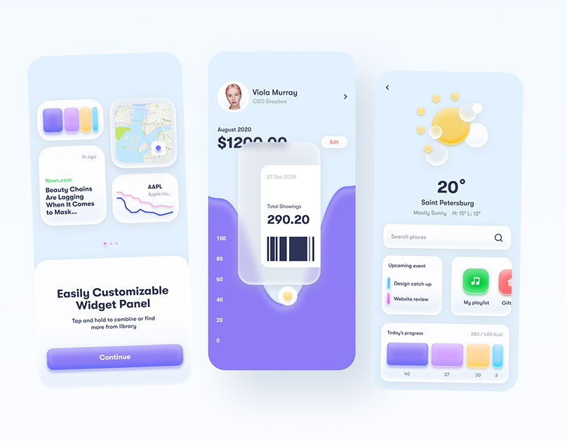
Anyone deep into vibe coding knows this feeling: you ask AI to generate a landing page, everything works, you open it — and there it is. Purple-blue gradient headline, three rounded cards in a row, emoji icons everywhere, rainbow badges. It looks… fine. But it has an unmistakable flavor: obviously AI-generated.
This guide's thesis might sting a little: taste isn't talent — it's rules that can be written down. AI has no taste, but it can execute your taste flawlessly. If you think AI-generated interfaces look ugly, it's probably not the AI's fault. You just never explained your taste clearly. Here are seven actionable rules.
1. Show references before stating requirements
"Make a beautiful landing page" is one of the least effective prompts you can give, because "beautiful" in AI's training data means "averagely beautiful" — the most generic version possible. The right move: drop 3–5 screenshots of sites you actually like and say "build it with this feel."
Even better: articulate why in one sentence — "I like its whitespace," "I like that it uses only one accent color." AI can't read your aesthetic sense, but it can read executable descriptions like "generous whitespace" and "minimal accent colors."
2. Design tokens first, pages second
The amateur move: have AI write pages directly, inventing colors and fonts as it goes. The professional move: define a token set first, then have every page reference it.
- Colors: max 3 primary colors + one neutral gray scale. Use an existing scale (like Tailwind's neutral) — don't let AI mix its own.
- Fonts: 1–2 typefaces, period. For Chinese interfaces, stick to the system font stack; no experiments.
- Radius & spacing: 3 radius tiers (sm/md/lg), one 4px-base spacing scale. Consistent everywhere and it can't look bad.
Write the tokens into your project's instruction file (AGENTS.md / CLAUDE.md) and the AI follows them on every generation — taste, front-loaded, once and for all.
3. Typography is 80% of the look
A harsh truth: what most people perceive as "design polish" is actually typography. Clear type hierarchy (headings/body/captions at least 4px apart), generous line-height (1.6–1.8 for body), weight contrast (at most two weights for emphasis) — nail these three and the interface passes.
The anti-pattern is AI's default output: all text roughly the same size, cramped line-height, bold everywhere — no information hierarchy, and the eye doesn't know where to land.
4. Whitespace and rhythm: one screen, one message
AI has a bad habit: afraid the page looks "empty," it stuffs — one more feature card, one more image, another testimonials section. When every block screams, nothing gets heard.
The rule is simple: delete half the decoration; one screen makes one point. Separate sections with whitespace, not dividers and background blocks. Whitespace isn't "no design" — whitespace is design.
5. Restraint in motion: one motion language per page
AI-generated motion is often a motion potluck: fade-in here, bounce there, parallax scrolling, hover flips — all of it. Remember: motion is punctuation, not prose. Use one motion language per page (e.g., a uniform 200ms fade-up), consistent duration, consistent easing — and the whole thing instantly feels crafted.
6. Keep a "don't" list
Half of taste is knowing what to refuse. Put this list in your project instructions too:
- ❌ Purple-blue gradient headlines (unless purple is actually your brand color)
- ❌ Gratuitous glassmorphism (unreadable text, wasted GPU)
- ❌ Emoji as icons everywhere (use linear icon sets like Lucide)
- ❌ Rainbow badges and tags (status colors belong on statuses)
- ❌ Three feature cards in a row on the hero (that's a 2015 template)
"Never use gradients" is 100x more useful than "make it prettier" — negative instructions are the aesthetic language AI understands best.
7. The final trick: make AI the client, you the designer
After the first draft, don't tweak details yet. Switch roles and ask: "If you were a picky design director, what are the three things this page should delete?" AI is far more reliable in critic mode than in creator mode — generation drifts toward the average, but subtraction forces judgment.
One sentence to sum up: AI's aesthetic equals the average of its training data; your taste should be a clear direction. The clearer the direction, the less the AI drags you toward the mean. In the end, vibe coding isn't decided by prompt tricks — it's decided by whether you have a picture of "good" in your head, and whether you can translate it into rules the AI understands.
Related articles

Every vibe project hits the same moment: a list page firing a dozen DB queries per load, the database melting under modest traffic. This guide starts from the three-question caching mindset, then layers HTTP cache headers, Next.js data caching, Redis application caching with key design and the penetration/breakdown/avalanche defenses, and AI result caching (semantic cache, prompt caching), plus invalidation strategy and a launch checklist.

On October 3, 'Sites in ChatGPT' hit the HN front page with ~209 points and 218 comments. Not a launch — a reckoning: is prompt-to-URL a toy, a prototype host, or a productivity tool? The four debates, the doc-backed facts (D1/R2, sign-in, custom domains), and three verdicts for vibe coders.

On October 3, engineer Kevin Liao published a polemic that hit the HN front page: agent memory plugins are a lottery over RAG snippets; what agents need is a documentation workspace. The essay's diagnosis, its open-source Operator Memory plugin, the two strongest objections, and the minimal practice you can start tonight.