Stop Guessing Button Colors: A/B Testing and Experiment Design for Vibe Projects
Low traffic means you need experiment design more, not less. A field guide for vibe builders: the three myths (sample-size illusion, peeking, testing only UI colors), a one-sentence hypothesis template with north-star vs. guardrail metrics, a sample-size lookup table and run-length formula, a 30-line Next.js feature-flag middleware with a three-stage rollout, five classic traps with real crash stories, a PostHog/GrowthBook/DIY cost comparison, and a one-page experiment retro template.

Opening: When Was the Last Time You Changed a Button Color on Gut Feeling?
Almost every vibe developer has done this: stare at the landing page for three minutes, decide "this blue isn't premium enough," open the editor, switch it to dark green, deploy, screenshot it to the group chat. The next day you think "actually the old blue converted better," and switch it back. A week passes, the button has worn four colors, conversion hasn't moved — and you don't even know whether it moved, because you never looked at the data.
The more painful contrast: Google once tested 41 shades of blue links and made an extra $200 million a year. Same color change — theirs prints money, yours is performance art. The difference isn't taste. It's that they had experiment design, and you only had a feeling.
The most common excuse from solo teams is: "I only get 200 visitors a day, I can't afford A/B testing." The first half of that sentence is true; the second half is wrong. The correct conclusion for low traffic isn't "skip experiments" — it's "run low-traffic experiments": different frameworks, different metrics, different decision rules. This guide gives you that framework: how to write a hypothesis, how to size your sample, how to build flags, and five traps that can waste two weeks of your life — all copy-paste-ready.
The Three Myths: Where 90% of Solo-Team Experiments Die
Myth 1: Sample-size illusion — "After three days, variant B is up 30%"
Your landing page gets 60 visitors a day. Group A: 30 people, 3 conversions (10%). Group B: 30 people, 4 conversions (13.3%). B is "up 33%," and you're ready to ship it. But that one-conversion gap is pure coin-flip noise — tomorrow it could flip the other way. Remember a rough but useful intuition: around a 10% conversion rate, anything under ~1,000 samples per group should be treated as noise first. At low traffic, most of what looks like "signal" is noise wearing a signal costume.
A real cautionary tale: Bing once ran an experiment showing a 12% revenue lift. Before popping champagne, the team asked "why" — and found a bug in the ad-serving logic. Had they shipped it, they'd have launched a bug that "looked profitable but burned user trust." When the numbers look great, don't celebrate first. Ask: is this result even believable?
Myth 2: Peeking too early — significant on day 4, shipped on day 5
This is the most common way small teams die. The experiment goes live, you check the dashboard three times a day, on day 4 the p-value turns "significant," and you ship immediately. The problem: checking daily means you've run 4 tests, and your false-positive rate is no longer 5% — it's close to 20%. That's peeking — and peeking without paying for it.
Big companies use sequential testing: you're allowed to look mid-flight, but every look "spends" part of your significance budget — or they use Bayesian methods outright. Your simplified version is in section four; for now, remember the conclusion: decide the minimum run duration before launch, and don't call a result until the days are up, no matter what.
Myth 3: Only testing UI colors — working hardest where it matters least
Changing a button from blue to green might move conversion 1–2%; cutting a signup flow from 5 steps to 2 can double it. Solo teams have the scarcest time, yet spend their experiment budget on colors, border radii, and font sizes — because they're the easiest to change, and they create the illusion of "optimizing."
Expedia once removed a single optional "Company Name" field from checkout and made an extra $12 million a year. Note: not a color change — removing one field that confused users. The Obama 2008 campaign tested landing-page "image × button copy" combinations and raised an extra $60 million — they tested message and promise, not hex codes. My recommended ordering: test flows first (step count, field count), then promises (headlines, price framing), and only then visuals (colors, layout). One experiment in the first two categories beats ten color experiments.

The Minimum Viable Experiment Framework: One-Sentence Hypothesis + Two Metrics
Big companies write ten-page experiment docs. You don't need that. You need a framework you can fill in within 5 minutes and paste into Notion: a one-sentence hypothesis + one north-star metric + one or two guardrail metrics.
The one-sentence hypothesis template
Fill in the blanks:
I believe [change] will cause [who] to [behavior change] in [scenario], because [reason]; if [metric] relatively improves by [amount] within [timeframe], we ship it.
A real example: "I believe pre-selecting the annual plan on the pricing page will lift annual-plan conversion among visitors arriving from the homepage, because most users don't care about monthly vs. annual, and a pre-selected default removes decision friction; if annual conversion relatively improves by ≥20% within 3 weeks, we ship it."
If you can't write that sentence, you haven't thought it through — don't launch the experiment yet. 90% of "failed experiments" are actually "unwritten hypotheses" — when the data comes back, you can't even say what it proved.
North-star metric vs. guardrail metrics
The north-star metric is the one number you want to improve — one per experiment. Guardrail metrics are numbers that must not get worse — one or two of them. An experiment without guardrails is reckless: you cut signup to 1 step, conversion rises, but spam signups and support tickets triple — is that a win?
| Experiment | North-star metric | Guardrail metrics |
|---|---|---|
| New onboarding flow | 7-day retention | Signup conversion doesn't drop >5%; page error rate doesn't rise |
| Pricing page defaults to annual | Annual-plan conversion | Overall paid conversion doesn't drop; refund rate doesn't rise |
| Homepage headline rewrite | Signup conversion | Bounce rate doesn't rise >10%; avg. time on page doesn't halve |
Guardrails have a hidden job: they're your circuit breaker. If a guardrail clearly degrades mid-experiment, kill the test without waiting for the full run — a small team can't afford "burning two more weeks of user trust for significance."
What to Do About Low Traffic: The Scientific Way for Small Samples
Now the core question. You get 200 visitors a day; Google gets 2 billion. Copying the big-company playbook of "run two weeks, check p-value" means running until the heat death of the universe. The low-traffic experiment philosophy is three sentences: test big changes, run longer cycles, and think like a Bayesian.
Move 1: Only test changes "worth testing" — MDE is your filter
MDE (Minimum Detectable Effect) is the smallest lift you can detect. The less traffic you have, the larger the MDE you can detect — that's a mathematical iron law, not something effort fixes. A site with 200 daily visitors needs months to detect a 5% lift, but only weeks to detect a 30–50% lift.
So the experiment-selection rule for small teams: changes with an expected lift under 20% aren't worth an experiment — just ship them on judgment (color tweaks and copy micro-edits all fall here). Reserve experiment capacity for changes that could move things 30%+: cutting flow steps, restructuring pricing, changing the core promise, removing signup fields. That's not laziness — it's math forcing you to prioritize.
Move 2: The sample-size lookup table — compute the run length before you start
The estimation formula (a common simplification for 80% power, 5% significance, two-sided test):
n per group ≈ 16 × p̄(1 − p̄) / δ²

p̄: baseline conversion rate (e.g., 10% = 0.10)
δ: the absolute lift you want to detect
   (baseline 10%, want to detect a relative 30% lift → δ = 0.10 × 0.30 = 0.03)
Don't want to do math? Use the table (unique visitors needed per group):
| Baseline conversion | Detect +20% | Detect +30% | Detect +50% |
|---|---|---|---|
| 5% | 7,600 | 3,400 | 1,200 |
| 10% | 3,600 | 1,600 | 580 |
| 20% | 1,600 | 710 | 260 |
Run-length formula: days = total required sample ÷ daily unique visitors entering the experiment (with 50/50 split). Example: your landing page gets 200 unique visitors a day, baseline signup conversion is 10%, and you want to detect a 30% relative lift — the table says 1,600 per group, 3,200 total, 3,200 ÷ 200 = 16 days. Plus one iron rule: round up to whole weeks — run 21 days (3 full weeks), because weekday and weekend users are two different species (see trap #4 below).
If the math says 60 days? Don't force it. Three options: ① raise the split to 80/20 (more traffic to the variant — for when you're confident); ② pick a change with a bigger expected lift; ③ skip the experiment, ship it, and watch the guardrails — not every decision needs experimental blessing.
Move 3: Sequential-testing thinking + Bayesian intuition
Sequential testing answers "can I peek at results mid-run?" The core idea in one sentence: you can look, but every look costs money — statisticians call it alpha spending: each interim check tightens the significance threshold. Big companies use dedicated algorithms (AGILE, mSPRT); you don't need the formulas, just steal the thinking:
- Fix a minimum run duration before launch (e.g., 2 full weeks) — no calling results before time is up. That's the cheapest sequential test there is;
- Only check at pre-set checkpoints (e.g., day 7, day 14), not three times a day;
- Write stopping rules in advance: guardrail degrades past threshold → stop immediately; north star up >50% with guardrails flat → can ship early; anything else → run it out.
Bayesian intuition reframes the question. Frequentism asks "is p < 0.05?" — alien language. Bayesianism asks "what's the probability B beats A, and by how much, most likely?" The tool tells you directly: "87% chance B is better, median expected lift +6%." For a solo team, that framing is far more decision-useful: is 87% enough for you to commit? For a small tweak, yes; for a pricing change, no — the probability number lets you quantify your own risk appetite instead of being held hostage by the magic 0.05. GrowthBook's default engine is Bayesian, and PostHog's experiments support it too — one reason I recommend both.
Feature Flags in Practice: A 30-Line Rollout System
The engineering foundation of A/B testing is feature flags. Don't start by wiring up a massive experimentation platform — a solo team's flag system needs 30 lines of code + one cookie, solving exactly two problems: stable bucketing (the same user always sees the same version) and an instant kill switch (roll back the moment something breaks).
Minimal implementation with Next.js middleware
// middleware.ts — stable bucketing by user-ID hash, written to a cookie
import { NextResponse } from 'next/server'
import type { NextRequest } from 'next/server'

// Simple string hash mapping a user into buckets 0-99
function hashToBucket(id: string): number {
  let h = 2166136261
  for (const c of id) {
    h ^= c.charCodeAt(0)
    h = Math.imul(h, 16777619)
  }
  return Math.abs(h) % 100
}

export function middleware(req: NextRequest) {
  const res = NextResponse.next()
  // Visitor ID: issue one if missing, keep for a year so a user
  // always lands in the same bucket
  let vid = req.cookies.get('vid')?.value
  if (!vid) {
    vid = crypto.randomUUID()
    res.cookies.set('vid', vid, { maxAge: 31536000 })
  }
  // Experiment pricing-v2: 20% rollout, buckets < 20 go to variant
  const inExp = hashToBucket(vid + ':pricing-v2') < 20
  res.cookies.set('exp_pricing_v2', inExp ? 'b' : 'a', { maxAge: 86400 })
  return res
}
Pages read the exp_pricing_v2 cookie to render version A or B, and analytics events must carry the variant. Three details to get right: ① include the experiment name in the hash (':pricing-v2') so different experiments bucket independently; ② keep the cookie TTL shortish (1 day) so you can re-bucket after adjusting the rollout; ③ always report the group assignment with your events — otherwise you can't tell who was who at analysis time, the most common failure of homegrown flags.
The three-stage rollout strategy
Flags aren't just for A/B tests — they're for safe launches. Any risky change goes through three stages:
| Stage | Traffic | Purpose | Watch |
|---|---|---|---|
| 1: Smoke | 5% | Prove there are no bugs | Error rate, guardrail metrics; 1–2 days |
| 2: Experiment | 50% | Measure the effect properly | North-star metric; full pre-set run (whole weeks) |
| 3: Rollout | 100% | Wrap up | Keep the kill switch for a week; delete flag code after |
Stage one at 5% is the whole point: a production bug exposed at 5% traffic costs one-twentieth of a full-rollout incident. I've watched too many indie developers "push straight to 100%" and then apologize in the user group — a 5% smoke test prevents 90% of those apologies. And flag code needs an expiry date: delete the flag branches within two weeks of the experiment ending, or in six months your codebase will be full of if/else branches nobody dares touch — that's tech debt proper.
Five Classic Traps, Each With a Real Crash Story
Trap #1: Novelty effect — users are curious, not converted
Any big UI redesign looks good in the first few days — users click around simply because "hey, it looks different." Two weeks later curiosity fades and numbers revert. Solo teams crash here most often: new landing page live for 5 days, conversion up 25%, you ship it; a month later conversion is worse than the old version, but the old code is already deleted.
The fix: run redesign experiments at least 3–4 weeks and watch whether the lift decays. If it's +25% in week 1, +12% in week 2, +3% in week 3, that's pure novelty — kill it. Real improvements are flat, not fading.
Trap #2: Peeking — checking the dashboard three times a day manufactures significance
The mechanism was covered in myth 2; here's a typical crash: an indie hacker's SaaS ran a pricing test, checked data daily, hit "significance" on day 6, and raised prices that night. A two-week-later review showed that a full 3-week run would have read "no difference" — day 6 was a random peak, and he made the call exactly at the crest of the wave. Real conversion dropped 8% after the hike; he quietly lowered prices again, losing two weeks of revenue and some longtime users' trust in the round trip.
The fix: lock the minimum run duration and checkpoints before launch (see move 3 in section four). Can't resist looking? Fine — but only check whether guardrails are on fire, never whether the north star is significant.
Trap #3: Bucketing contamination — one user with a foot in each boat
If your bucketing key is a cookie, a user sees version A on their phone and version B on their laptop — the data is mixed. More insidious: clearing cookies, switching browsers, or incognito mode all re-bucket the "same" user as new. Logged-in products should hash on user_id — that cures it completely; for logged-out products, at minimum use a first-party cookie with a long TTL and attribute analysis by first-assigned group, not by each visit.
The fix: logged-in products always bucket on a user_id hash; logged-out products should accept 5–10% contamination as normal, but never change the bucketing key mid-experiment — swapping keys is equivalent to restarting the test.
Trap #4: Not running full weeks — weekend users and weekday users are different species
The classic profile for dev tools: weekdays bring serious professionals trialing your product; weekends bring casual browsers — conversion can differ 3×. Ten days (with 2 weekends) vs. fourteen days (with 2 weekends) can give opposite conclusions. E-commerce flips it: weekends are prime time. Extremes: payday, holidays, or the day you hit the Product Hunt front page all warp your traffic mix.
The fix: always round experiment durations to whole weeks (2, 3 weeks) — never awkward numbers like 10 or 12 days. If a big sale, a launch-day spike, or a viral share lands mid-experiment, drop that slice of data or rerun — don't be sentimental. Contaminated data is more expensive than no data.
Trap #5: Multi-metric fishing — test 10 metrics and one will be "significant"
You watch signup conversion, activation, retention, paid conversion, ARPU, time on page… one of ten metrics hits p < 0.05, and you declare "experiment succeeded." Statisticians call this the multiple-comparisons problem: the more you measure, the likelier a false positive. With 10 metrics, the chance of at least one false positive is 40% — worse than a coin flip.
The fix: declare exactly one north-star metric before launch, and judge only on it. Other metrics are observers — they can explain, never convict. If you must watch several, learn the Bonferroni correction (divide the threshold by the metric count: 0.01 instead of 0.05 for five metrics) — for small teams, "fewer metrics, more trust" is enough.
Tooling: The Solo-Team Cost Math
Three options, ordered by laziness:
| PostHog | GrowthBook | Homegrown (30-line flag + spreadsheet analysis) | |
|---|---|---|---|
| Experiments + analytics | All-in-one: feature flags and experiment analysis built in | Experiments and flags only; bring your own analytics | All DIY |
| Price | 1M events/month free, usage-based beyond; solo projects rarely pay | Self-hosted is fully free; cloud has a free tier | $0, but costs your time |
| Setup cost | Half a day: install SDK, define events | 1–2 days: host the service, connect data source | 1 day for flags; analysis via exported CSVs |
| Bayesian analysis | ✅ supported in experiments | ✅ Bayesian engine by default | ❌ hand-roll formulas or use an online calculator |
| Best for | Projects with no analytics yet — one step | Projects with an existing data pipeline that just need experiments | Minimalists, or <1 experiment per month |
My take, bluntly: new projects without analytics — go PostHog, since you'll need analytics anyway and flags plus experiments come free; projects with an existing data pipeline — self-host GrowthBook, free and professionally analyzed; homegrown only fits minimalists running a couple of experiments a year — and don't hand-compute the analysis; use Evan Miller's online A/B calculator (evanmiller.org/ab-testing) and copy the verdict in 10 minutes. The most expensive option is actually "maintaining your own experimentation platform to save $20/month" — bill your time at consulting rates and it's at least $50 an hour.
The One-Page Experiment Retro Template: An Unwritten Experiment Is an Undone One
Within 24 hours of the experiment ending, fill in this table and paste it into the team wiki (yes, even if the team is just you). Teams that skip retros re-run the same test a year later — I've watched an indie developer test "annual pre-selected" twice because the first result was buried in some chat log.
| Block | What to write (2–3 sentences each) |
|---|---|
| Background | Why this experiment? What did data/feedback show? |
| Hypothesis | The one-sentence hypothesis, verbatim (traceability lives here) |
| Design | What A/B were, split ratio, days run, sample size, north-star + guardrails |
| Results | Numbers + verdict: B converted 12.1% vs A 9.8%, +23% relative, guardrails clean; key chart screenshot |
| Decision | Pick one: ✅ ship / ❌ kill / 🔁 iterate (say what changes before re-testing) |
| Next steps | Concrete actions + owner + deadline; when flag code gets deleted |
Note the ritual of "pick one": "inconclusive, keep observing" is not allowed — continued observation is the most expensive decision, because it occupies your experiment slot (a small team runs 1–2 experiments at a time). Inconclusive = kill, with a written "why we killed it." That record is worth as much as a winning experiment.
Finally: Its Place Next to the Other Two Guides, in One Sentence
We previously published guides on user feedback loops and analytics instrumentation. Their division of labor in one sentence: user feedback tells you what to test (where users complain), analytics tells you what the current state is (where the funnel collapses), and A/B testing answers whether the fix worked (is your solution real) — they're upstream, midstream, and downstream of one pipeline, not substitutes. The places with the most feedback and the steepest funnel drop are where your next hypothesis comes from.
Back to the title: stop changing button colors on gut feeling. Not because color doesn't matter, but because until you can say "this change should bring 30% lift, run 3 weeks, north star is signup conversion," it doesn't deserve your experiment budget. The scientific method for low traffic is, at bottom, a kind of honesty: admit you can't measure small lifts, then put all your firepower on big changes. Google can test 41 shades of blue because it gets 2 billion trials a day; you get 200 visitors a day — your 41 shades of blue are called performance art.
Related articles
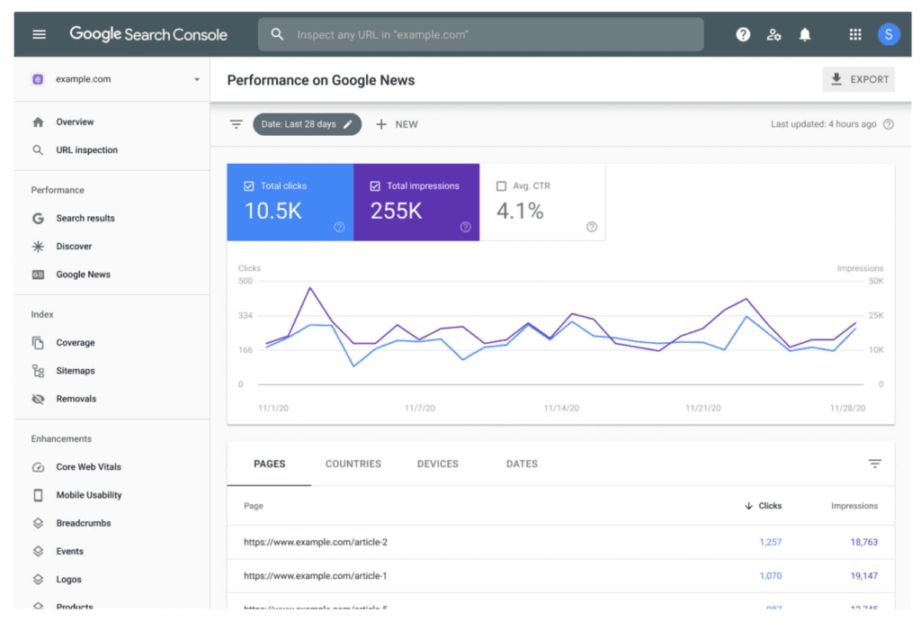
Your vibe-coded site is live — now nobody can find it. This guide gives you the full organic-traffic playbook: a 30-item technical SEO checklist in three tiers, copy-paste Next.js metadata and sitemap code, dynamic OG image generation, safe programmatic SEO without triggering Google penalties, three content growth plays (docs-as-marketing, public changelogs, tutorial topic formulas) with a 4-week calendar, the 4 Search Console reports worth watching, and 5 anti-patterns.

Vibe projects rarely die from missing features — they die in the first minute after signup. This field guide argues onboarding's job isn't to teach the product but to deliver the promised value fast: a Value Promise Canvas to find your Aha moment, a decision table for three onboarding patterns, 7 signup fields to cut, empty-state copy templates, a paste-ready 3-step React tour component on localStorage, 4 funnel metrics with event naming, and a 10-item pre-launch audit.

Auth vendors raise prices, free tiers get killed, even big tech's own children get shut down. A solo team has no lawyers or procurement leverage — its only armor is grading every external dependency and writing a one-page escape plan for each critical one. Includes a ready-to-use triage matrix, plan template, 10 anti-lock-in selection questions, and dissections of the Parse, Heroku, and Auth0 blowups.