Give Users a Starting Point They Can Edit: Template Galleries for Vibe Projects
Users often churn at the blank page, not because the product is bad but because the first step is too hard. This guide makes a template gallery one-step usable: 6 to 10 templates, task-based names, realistic preview samples, one-click apply, free editing afterward, plus data checks and a launch checklist.
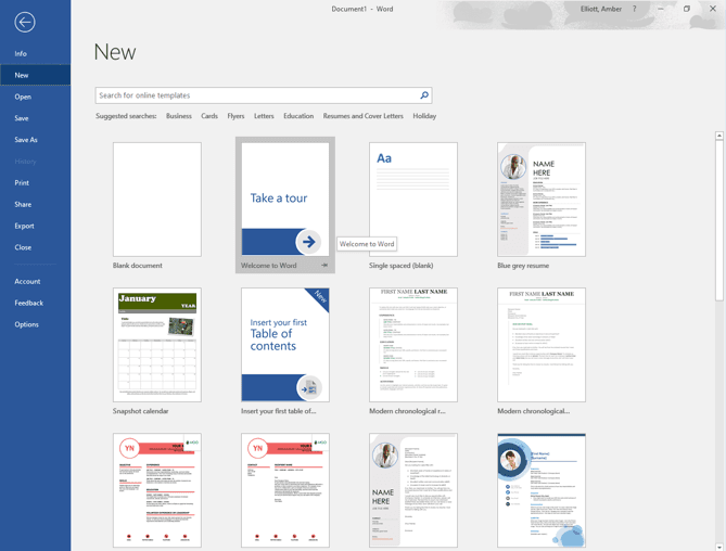
All people and products in the examples below are fictional.

The verdict first: a template gallery is not a pile of assets — it is the step across the blank page
Almost every product with a creation feature hits the same wall: a user signs up, opens a new page, and freezes in front of a blank sheet. Not because they have no need, but because they do not know where to start. What should the title be, how should the structure run, which fields are required, what will it look like when done — all of it has to be invented on the spot. Many users churn right there, not because the product is bad, but because the first step is too hard. A template gallery exists to solve exactly that: give users a ready-made starting point to edit, instead of asking them to imagine one from nothing.
My verdict is blunt: a template gallery succeeds or fails not on how many templates it has, but on how many steps it takes a user to go from "seeing a template" to "having something usable." More than three steps and the gallery is decoration; one step and it is a growth engine. This guide explains how to get to one step, in six practices, plus a launch checklist.
A boundary note, to avoid duplicating existing guides: AI prompt-template libraries cover prompt collection and reuse, and docs-site guides cover external documentation structure — neither is repeated here. This guide covers only the in-product "new from template" flow: the row of templates users see when they hit New, from browsing and previewing to applying and managing afterward. The running fictional example is Gu Dao, founder of "Island Notes," a collaboration tool for small remote teams, who added a new-document template gallery. All numbers and feedback are invented, for method only.
Step 1: keep the count at 6 to 10 — more choice is no choice
The most common template-gallery mistake is greed. A team spends two weeks building 60 templates, reasoning that more complete is better, and users open the gallery, scroll three screens without deciding, pick an ill-fitting one at random, or simply close it. Too much choice is no choice — an old finding in psychology that applies perfectly to template galleries. Users arrive with a specific task: write a weekly report, plan a project, take meeting notes. Giving them 60 options hands the entire decision cost back to them.
I recommend starting with 6 to 10 templates covering users' most common tasks, not every conceivable task. How to pick those? From data, not gut feeling. Look at the first-line titles users write when they create blank documents, look at the "how do I use this product to do X?" questions support receives most, look at the document structures users share with each other in the community. Gu Dao's team filtered exactly this way: first lines of blank notes showed weekly reports, project plans, meeting notes, reading notes, and travel checklists accounting for 70% of creations, so version one shipped just 8 templates built around those five tasks. Template usage quickly overtook blank creation — evidence the selection was right.
A small count has a second benefit: every template gets real craft. A 60-template team can only spare a little time per template, so quality varies wildly; an 8-template team can write proper sample content, field explanations, and mobile display checks for each one. A gallery's quality feel comes from every template being good, not from the total looking impressive. Once data on those 8 is in, add one or two more per round based on feedback — that is the healthy growth rhythm.
Step 2: name templates by task, not by concept
A template's name is the only basis for the user's decision; get it wrong and even a great template goes unclicked. Bad names come in two kinds: concept words like "Structured Notes," "Efficient Workflow," or "Knowledge Management Template," which leave users unsure what the template is actually for; and internal jargon like "OKR Retro V2" or "Sprint Review Standard," which only the team understands. Correct names state the task in the user's own words: "Weekly Report," "Project Plan," "Meeting Notes," "Travel Checklist." Seeing the name should instantly tell users whether this is what they came for.
Under the name, add one line explaining what is inside and who it suits. For example, under Weekly Report: "Done this week, plan next week, blockers — for personal and team weekly reports." Under Project Plan: "Goals, milestones, owners, task table — for teams of three to ten." That line lets users filter before clicking in, avoiding the click-in, realize-it-is-wrong, back-out loop. Gu Dao's first version had names without descriptions, and many users opened the project plan, found a budget table they did not need, and backed out. After descriptions were added, wrong-template picks fell noticeably.
One more detail: sort by task frequency, not alphabetically or by creation date. The most-used weekly reports and meeting notes go first; the least-used fold away at the back. Sorting sounds trivial, but it decides the gallery's first impression: the first thing users see should be the thing they most likely need, not the thing the team most recently built.
Step 3: preview before applying, with realistic sample content
When users open a template, what they most want to know is: what will this look like applied? Many products fail here, previewing only an empty shell with "type here" placeholders everywhere. Users still cannot tell whether the template fits, so they apply blindly, discover the mismatch, and delete and restart. A proper preview contains a filled-in example that reads like the real thing: a realistic weekly report in the weekly report template, a realistic small project in the project plan, a realistic meeting record in the meeting notes. Seeing the example lets users judge whether the structure matches their need.
Sample content must be clearly labeled as sample, so users do not mistake it for their own data or someone else's real data. A simple label works: "Sample content below — clear it with one click after applying," or sample text shown in grey. Gu Dao's team skipped the label at first, and a user mistook the sample weekly report for a colleague's work and asked the colleague about it. After the label was added, that confusion vanished. The more realistic the sample, the more important the label — the two go together.
The preview must also answer a key question: can users act right there? My recommendation: put a prominent "Use this template" button on the preview page that generates the document in one click — no second confirmation, no "please enter a document title" dialog. Titles can be edited after creation; the creation step itself should be as fast as possible. Every extra confirmation step loses users. Gu Dao cut "use template" from two steps to one and saw completion rise by nearly 30%. The difference between one step and two looks small; multiplied across thousands of uses, it is enormous.
Step 4: after applying, leave traces so users know what the template brought
After a template is applied, products often skip an important courtesy: letting users tell template content apart from their own. The simplest approach: when generating the document, add a small line at the top such as "Created from the Weekly Report template," and put sample content in a form that can be cleared with one click rather than mixed indistinguishably with the user's own writing. Users who want a clean start can clear the sample in one tap; users who want to edit the sample can do so directly without deleting placeholder text first.
Going further, the fields and structure a template brings should stay freely editable. Some products lock templates down — users cannot delete fields or reorder sections — turning a starting point into a cage. The right approach: the template only provides the start, never the constraint. Users can delete any section, add any section, retitle anything, and the product should not pop up to warn them that they have "deviated from the template." The template's mission ends the moment users click "Use"; after that, the document is theirs, and the product should stop second-guessing.
There is also a versioning question: when a template is updated, should documents created from the old version change? My answer is no — users may have written extensively in their documents, and a template change could scramble them. New templates should affect only newly created documents; old documents stay as they are. If the new template is genuinely better, offer an optional "upgrade to the new template structure" entry inside old documents and let users decide. Keeping the choice with the user is a core principle of template-gallery design.
Step 5: search and categories become essential once the gallery grows
With 8 templates, categories and search barely matter — users can see everything at a glance. At 20 or 30 templates, a gallery without them collapses back into a pile. Categories must follow the same rule as names: split by task, not by concept. "Work Reports," "Project Management," and "Life Records" — split by task scenario — are instantly legible; "Structured," "Visual," and "Collaborative" — split by concept — leave users still wondering where to look.
Search has two modest but firm requirements. First, it must match task keywords, not just template names: searching "meeting" should find the meeting notes template even if the name match is indirect. Second, a no-result search should not show a bare "no results" but a way forward: "No matching template found — you can start from a blank document, or tell us what template you need." After Gu Dao's gallery grew to 25 templates, searches rose, and no-result searches hit 20%. Mining those unanswered keywords revealed users genuinely wanted "interview notes" and "reading lists" that did not exist, so the next batch added them. That is search's second value: a free list of user needs.
Community templates and official templates must be labeled separately. If users can share their own templates, community templates can quickly outnumber official ones, and users must be able to tell at a glance which are officially maintained and which are user-shared. Official means quality-assured and continuously updated; community means diverse in style but variable in quality. Mixing them unlabeled means a poor community template gets blamed on the product. Clear labels plus simple ratings or usage-based sorting let community templates complement the gallery instead of burdening it.
Step 6: judge the gallery by data, not by enthusiasm
After launch, watch three numbers. First, template adoption rate: what share of new documents are created from templates rather than blank? If it stays below 30% long-term, the gallery is not solving a real problem — either the templates are wrong or the entry point is too deep. Second, apply-to-complete rate: of users who click "Use this template," how many actually write content in the document rather than generating and immediately deleting it? A low rate usually means the preview misled or the sample content confused. Third, seven-day retention comparison: do users whose first document came from a template retain better at seven days than users who started blank? If template users retain clearly better, the gallery creates value; if there is no difference, it may just be a different way to create, not a lower barrier.
After two months of data, Gu Dao's team found weekly reports and meeting notes had the highest apply-to-complete rates, while the travel checklist had high adoption but low completion. Digging in, they found the travel checklist bundled flights, hotels, and budget sections — too heavy for users who just wanted a packing list. Splitting it into "Travel Packing List" and "Travel Itinerary" lightweight templates fixed completion. The lesson: gallery analytics must be per-template, not just totals, and each template's fate — optimize, split, or retire — should follow its own numbers.
Retiring templates should be decisive. A template nobody uses, left sitting in the gallery, only adds choice burden. My rule: review quarterly, and templates in the bottom adoption tier for two straight quarters get reworked or retired, not left to occupy a slot forever. A template gallery is not an archive; it does not need to keep every template ever made. Keeping every template in the gallery used and data-backed is the key to long-term health.
Launch checklist: tick every item before shipping
Finally, a checklist ready to use. One: is the count between 6 and 10, each mapped to a genuinely frequent user task? Two: do names use the user's task words, with a line beneath explaining contents and audience? Three: does the preview show realistic sample content, clearly labeled as sample? Four: does going from seeing a template to generating a document take exactly one step, with no extra confirmations or forms? Five: after applying, can sample content be cleared with one click, can the structure be freely edited, and do template updates avoid forcing changes on old documents? Six: once past 20 templates, are categories split by task scenario, does search support task keywords, and do no-result searches offer a way forward? Seven: is instrumentation complete — adoption rate, apply-to-complete rate, seven-day retention comparison, all breakable down per template? Eight: are community and official templates labeled separately, with a mechanism for handling poor-quality community templates?
Pass all eight and your gallery already beats most products on the market. Template galleries involve no hard technology; the hard parts are restraint and empathy: restrained counts, restrained categories, restrained visual noise — and empathy in every detail, from names and descriptions to previews and expiry handling, each considered from a first-time user's perspective. The blank page is the first barrier for every creation product, and a template gallery's value is helping users cross it effortlessly. Once across, users get a chance to discover the product's real value; if they never cross, the product's quality is irrelevant to them.
Comments (0)
Related articles

A big red timer at the top of the page is not a countdown done right. This guide gives solo teams a method: pick the format by distance, write deadlines to the minute with timezone, never fake urgency, design the expired state properly, and run a launch checklist.

Users saying they like your product is not validation. This guide shows solo teams how to run a five-person usability test: scenario tasks, think-aloud, no helping, severity grading, and a one-week rollout plan.

A dashboard full of charts can still say nothing. This guide gives solo teams a chart method: one chart, one conclusion sentence, five chart types chosen by question, honest axes, three meaningful colors, and a launch checklist.