The Weakest Link for Technical Founders: High-Converting Landing Page Copy in Practice
Your product isn't bad — it's just unclear. A hands-on playbook for vibe coders: the 5-second headline rule with 6 before/after pairs, a one-job-per-screen page architecture, solo-founder social proof tactics, CTA and form field optimization, plus an AI copy review checklist.
Intro: Your Product Isn't Bad — It's Just Unclear
Many vibe-coded products die an unfair death. The features work, the UI looks decent, it's deployed and stable in the cloud — but the landing page hero headline reads "A Next-Generation Intelligent Platform Redefining Efficiency," with a subhead like "AI-Driven Future of Work." A visitor arrives, spends five seconds unable to figure out what it is, who it's for, or why they should pick it, and closes the tab.
This isn't a copywriting theory problem; it's a survival problem. An indie developer only gets limited traffic — maybe a post on X, a Product Hunt launch, a share in a group chat. Every wave of visitors costs something to earn. If 90% of them leave without understanding what you do, you're pouring your most precious resource down the drain.
The good news: a high-converting landing page is not talent, and it's not magic. It's a structure you can copy plus a checklist you can self-audit against. This guide skips the theory and gives you "change it like this" instructions. When you finish reading, open your own landing page and revise it section by section — at minimum, visitors should be able to understand what you do. And "understood" is the first step toward conversion.
1. The 5-Second Rule: Three Questions Your Headline Must Answer
Within five seconds of landing on your page, a visitor's brain is doing one thing: deciding "is this relevant to me?" Your hero headline must answer three questions in that instant:
- What is it — the product category, classifiable in one phrase;
- Who it's for — the target user, the more specific the better;
- What changes — the tangible outcome the user gets, not a feature list.
The most common mistake technical founders make is writing "how we built it" into the headline. Users don't care which model or architecture you used. They care about one thing: can my problem be solved? The six before/after pairs below are all "typical technical-founder draft" versus "version a human understands" — steal the rewriting logic directly.
Pair 1: An AI expense-tracking app
Before: "An LLM-powered intelligent financial management platform" — answers zero of the three questions. What is it? "Platform" is empty. Who's it for? Unsaid. What changes? "Intelligent" is an adjective, not a change.
After: "AI expense tracker for freelancers: snap a photo of receipts, get tax-ready reports at month end" — what (expense tracker), who (freelancers), change (no manual bookkeeping, no tax-season panic). All covered.
Pair 2: A code review tool
Before: "Let AI safeguard your code quality" — "safeguard" is a correctly-worded nothing; it says nothing at all.
After: "A PR review bot for indie developers: automatically catches bugs and security holes on every commit" — the user instantly gets it: oh, this reviews my PRs so I don't have to beg someone for a review.
Pair 3: A habit-tracking app
Before: "Become a better you, starting every day" — that's a motivational poster, not a product headline. Any product could wear this sentence, which means it describes none.
After: "A habit tracker that gets you through 30 days: one-minute daily check-ins, automatic streak reminders" — concrete, tangible, with a mechanism.
Pair 4: An AI customer-service bot
Before: "A next-generation conversational AI customer service solution" — the moment the word "solution" appears, indie developers should be on alert: that's enterprise language written for procurement departments, not for users.
After: "24/7 AI support for small online shops: auto-answers 80% of common questions, escalates the rest to a human" — the number "80%" is the key; it quantifies the change. Caveat: the number must be real. Fabricating metrics is a red line, which the review checklist later will cover again.
Pair 5: A podcast transcription tool
Before: "Unlock the infinite possibilities of audio content" — "infinite possibilities" is the laziest possible phrasing, because it promises everything and therefore promises nothing.
After: "A transcription assistant for podcasters: one hour of audio becomes a timestamped transcript in five minutes" — a time contrast (one hour → five minutes) is one of the strongest ways to express value.
Pair 6: A project management tool
Before: "An all-in-one team collaboration space" — Notion already owns the words "all-in-one"; you won't win that fight. Worse, "team" is too broad: a 3-person crew and a 300-person company have completely different needs.
After: "A task board for remote teams of 3–10: see only three priorities a day, cut meeting time in half" — writing the team size down explicitly makes the target user feel "this was made for me." Only products that don't try to serve everyone dare to name their user this precisely.
The pattern across all six pairs: good headline = specific user + specific scenario + perceivable change. Delete every adjective (intelligent, next-generation, infinite) and replace them with nouns and numbers. After drafting, run the redaction test: cover your product name and logo — can the headline still be recognized as yours? If any competitor could wear it, rewrite it.
 Landing page design illustration
2. Landing Page Architecture: One Job Per Screen
Your headline passed the five-second test, and the visitor is willing to scroll. Now the page must answer the questions surfacing in their mind, in order — no shuffling allowed. The classic structure has six blocks: Hero → Pain resonance → Product demo → Social proof → Pricing → FAQ. Each screen does exactly one job; wherever a visitor stops, they should walk away with one complete message.
Block 1: Hero — the job is "understood in five seconds"
Ingredients: headline + one-line subhead (finishing what the headline didn't) + primary CTA button + product screenshot or GIF. The don't list:
- Don't lead with an autoplaying promo video — a visitor who hasn't decided to care about you yet will not watch a two-minute video;
- Don't stack three or more buttons — "Free trial," "See pricing," "Watch demo," "Contact us" all at once forces the user into a multiple-choice quiz, and choices create drop-off;
- Don't run a text-only hero — one screenshot of the real product interface beats three paragraphs of feature description. Technical founders often feel "my UI isn't pretty enough yet," but a real screenshot is always more credible than a polished concept render.
Block 2: Pain resonance — the job is "make the user nod"
Describe two or three concrete scenarios of the suffering your user endures right now. The key: write scenarios, not features. Before: "We support multi-template export, batch processing, and API calls" — a feature list nobody feels. After: "On reconciliation day at month end, are you still matching invoices row by row in Excel?" — the user nods, nodding is resonance, and only after resonance will they look at your solution.
Don't list: don't invent pains your users don't have ("Do you waste 3 hours every day?" — baseless numbers only breed resentment); don't frame pains as attacks on competitors — it's low-class and discounts your credibility.
Block 3: Product demo — the job is "prove it actually works"
Show a screen recording under 30 seconds or a three-step flow diagram: input → process → result. The classic technical-founder mistake is showing an architecture diagram or code screenshots — the visitor isn't here to interview you; they're here to confirm "this thing really runs." Before: a system architecture diagram with boxes and arrows flying everywhere. After: a 20-second GIF: upload invoice → AI recognition → report generated, three steps, done.
Don't list: don't pass off Figma mockups as product screenshots — get caught once and trust drops to zero; keep GIFs under 30 seconds, nobody has the patience for more.
Block 4: Social proof — the job is "prove I'm not the only one using this" (expanded in the next section)
Block 5: Pricing — the job is "feel affordable and easy to choose"
Indie pricing pages make two classic mistakes: too many tiers (free / basic / pro / team / enterprise…) and hiding the price behind "contact sales." Before: five tiers plus "enterprise: contact us." After: at most three tiers, the middle one highlighted "Most popular," each with one line saying who it's for. Transparent pricing is itself a trust signal — daring to show the number means you're confident about your value.
Don't list: don't write fuzzy prices like "from $9/mo" — either state the price or don't show it; when monthly and annual prices sit side by side, spell out "save 20%" explicitly instead of making users do the math.
Block 6: FAQ — the job is "sweep away the last hesitations"
Write five to eight questions people genuinely ask: does the trial need a credit card? Where is my data stored? Can I cancel? Is Chinese supported? FAQ isn't decoration; it's the last gate of the conversion funnel. Every unanswered doubt is one more reason to close the page.
Don't list: don't write PR-style self-Q&A ("Is your product good? — It's excellent!"); questions should come from real user inquiries — and if you have no users yet, write what you'd worry about as a user yourself.
3. The Solo Founder's Social Proof: No Big-Name Logos? No Problem
Social proof answers one question: "Besides you, does anyone else believe in this?" Big companies throw up logo walls; indie developers don't have those. So use the solo version — lightweight, authentic, and just as effective.
Tactic 1: Quote your early users verbatim
Find three to five real users (friends and community beta testers count), get one verbatim quote each, with name and identity. Before: "Users all say it's great!" — says who? After: "'Month-end reconciliation used to eat a whole afternoon; now it takes 20 minutes.' — Jie, freelance photographer, 2 months in." The key ingredients: a concrete number (20 minutes), a real identity (freelance photographer), a usage duration (2 months). With all three, credibility jumps immediately. Note: always get the user's permission before quoting; a pseudonym is fine, but the identity and duration must be real.
Tactic 2: Show real numbers
Put up whatever honest numbers you have: registered users, rating, tasks processed. Before: "Loved by users" — empty words. After: "2,300+ indie developers using it · Product Hunt #3 of the day · 4.8/5 average rating." Small numbers are fine — "300 real users" is a hundred times more credible than "widely loved." The indie advantage is precisely being small and real: visitors don't expect enterprise endorsements from indie products; they expect "real and usable."
Tactic 3: A "built in public" timeline
Turn your building process into proof: put a lightweight timeline on the page — "Oct: launched MVP, first 50 users; Nov: rebuilt the export flow from feedback; Dec: passed 500 users, launched paid tier." This does two things: it proves the product keeps iterating (not an abandoned demo), and it proves people use it and you listen. For vibe coders this is the cheapest social proof available, because you're already posting build logs — just curate them onto the page.
The shared principle behind all three: authentic beats big. Visitors can tell at a glance the difference between over-packaged "proof" and genuine traces. A link to a 300-star GitHub repo beats ten cries of "widely acclaimed."
 Conversion-focused landing page design diagram
4. CTA in Practice: Buttons and Forms Decide Conversion
The CTA (call to action) is the closest thing on your landing page to money — and the easiest thing for technical founders to phone in, with a button that just says "Submit" and a form that asks for everything imaginable. Here are field-tested conclusions you can apply directly.
Button copy: the verb decides everything
"Submit," "OK," and "Click here" are the worst button labels because they describe the action, not the reward. Users don't click to "submit"; they click to get something. Before: "Submit"; after: "Generate my first report — free." The formula: button copy = verb + what the user gets. More swaps:
- "Sign up" → "Start free trial";
- "Learn more" → "See how it works" (paired with a demo video);
- "Buy" → "Get Pro — 30-day money-back guarantee" (put the risk reversal next to the button).
Also: one primary CTA per page. It can repeat after the hero, after the demo, after pricing — but don't place "Free trial" and "Book a demo" side by side as equals on the same screen. Every extra choice creates a new cohort of drop-offs.
Form fields: each extra one costs you conversions
There's a widely observed industry rule of thumb: every additional form field visibly drags conversion down; going from 3 fields to 6 can roughly double your abandonment. (Note: this is common industry experience, not a precise scientific finding — it varies hugely by product and traffic source. Use it as a decision-making direction, not a formula.)
The practical move: the hero signup/trial form asks for email only. Get people in first; ask for details after they've built up sunk cost. Before: name, company, title, phone, email, captcha, six fields standing in a row — users see it and leave. After: one email input plus a "Start free" button. Company name, team size — ask later, inside post-signup onboarding, when the user has already decided to try and tolerance is completely different.
Free trial vs. paid upfront: totally different CTA strategies
This is the dilemma indie developers agonize over most. The deciding test is a single question: can your product's value be felt within five minutes?
If yes (true for most tools and productivity apps), use a free-trial CTA: "14-day free trial, no credit card required." The "no credit card" part is critical — every credit card request is a major drop-off event. Let users feel the win first, then talk money.
If no (say, a bookkeeping tool whose value only shows at month end), a free trial backfires — users try it for three days, feel nothing, leave, and mutter "not useful." The CTA should then be "low-friction paid + refund promise": "$9 for the first month, 30-day refund." Payment itself is a filter: users who paid nine dollars will seriously use it for a month; free riders won't.
One-line summary: value felt fast → free trial lowers the barrier; value felt slow → low-price paid tier plus a refund promise filters for serious users. A CTA isn't "the more generous the better" — it's good when it matches your value-delivery rhythm.
5. Reviewing AI-Written Copy: A Prompt Framework + 5 Human Checks
You're a vibe coder — of course you can use AI to write copy. But AI-written landing page copy fails in predictable ways, and you need to know what to check. First, a multi-version generation prompt framework:
"You are a senior SaaS copywriter. Product: one-line description (who it's for, what problem it solves). Target user: one-line persona. Generate 5 versions of hero headline + subhead. Requirements: each version answers 'what is it, who it's for, what changes'; banned words: 'redefine, empower, infinite possibilities, next-generation' and similar hollow adjectives; each headline under 20 words; score each version 1–10 on 'specificity' with a brief self-critique."
Why this framework works: ask for five versions at once (a single version invites settling; multiple versions give you something to choose from); name the banned words explicitly (unsaid, the AI will use them); demand a specificity self-score (it forces the model to check its own vagueness). Then pick the best one or two and run the human review — five checks the AI can't do for itself:
- Exaggerated promises: AI loves "save 90% of your time" and "99% accuracy." For every number, ask yourself: would I dare post the data source in my user group? If not, delete it or soften it. One exposed fabrication zeroes out trust permanently.
- Jargon pile-up: "A Transformer-based multimodal RAG-enhanced agent" — written for investors, not users. The test: show it to a non-technical friend; can they say what it does within five seconds? If not, rewrite.
- Audience mismatch: AI defaults to "teams" and "enterprises," but your users might be indie developers, freelancers, or small shop owners. Check every word against your real user persona: is this a word they'd actually use? They don't say "reduce costs and increase efficiency"; they say "save time, fewer late nights."
- Inconsistent tone: the hero chats like a friend, the pricing section suddenly turns into "final interpretation rights reserved…," and the FAQ slips into PR-speak. Read the whole page aloud; wherever it sounds like two different people wrote it, unify toward the most natural-sounding version.
- Missing SEO keywords: AI-generated copy is often beautiful but contains none of the words users actually search. Think about what users type into Google — "podcast transcription tool," "free invoice OCR" — those exact phrases must appear verbatim in the headline or subhead. Beautiful copy nobody can find might as well not exist.
Remember AI's place in copywriting: it's a "draft generator," not the "final approver." Multi-version generation solves the "no inspiration" problem; the review checklist solves the "embarrassing failure" problem. You need both.
Closing: A 10-Minute Self-Audit Checklist
You can act on this right now. Open your landing page and answer these eight questions in order — wherever you can't answer, revise:
- With the logo and product name covered, is the headline still recognizable as your product?
- Does the headline contain words like "intelligent, next-generation, redefine, solution"? Delete and replace with nouns and numbers.
- Does the hero show a screenshot of the real product interface? If not, go capture one.
- Is the pain section written as user scenarios or as a feature list?
- Is there at least one genuine user quote or real data point on the page?
- Does the primary CTA button promise a "reward" or describe an "action"? Does the form exceed three fields?
- Is pricing transparent with no more than three tiers?
- Read the whole page aloud — does it sound like one person wrote it?
Landing page copy has no perfect score — only "clearer than last week." Today you fix the "intelligent platform" in your headline; tomorrow you add a real screenshot; the day after, a genuine user quote. Every change keeps five-second visitors around a little longer. And for an indie developer, a visitor staying a little longer is one more chance to survive.
Related articles

Low traffic means you need experiment design more, not less. A field guide for vibe builders: the three myths (sample-size illusion, peeking, testing only UI colors), a one-sentence hypothesis template with north-star vs. guardrail metrics, a sample-size lookup table and run-length formula, a 30-line Next.js feature-flag middleware with a three-stage rollout, five classic traps with real crash stories, a PostHog/GrowthBook/DIY cost comparison, and a one-page experiment retro template.

Auth vendors raise prices, free tiers get killed, even big tech's own children get shut down. A solo team has no lawyers or procurement leverage — its only armor is grading every external dependency and writing a one-page escape plan for each critical one. Includes a ready-to-use triage matrix, plan template, 10 anti-lock-in selection questions, and dissections of the Parse, Heroku, and Auth0 blowups.
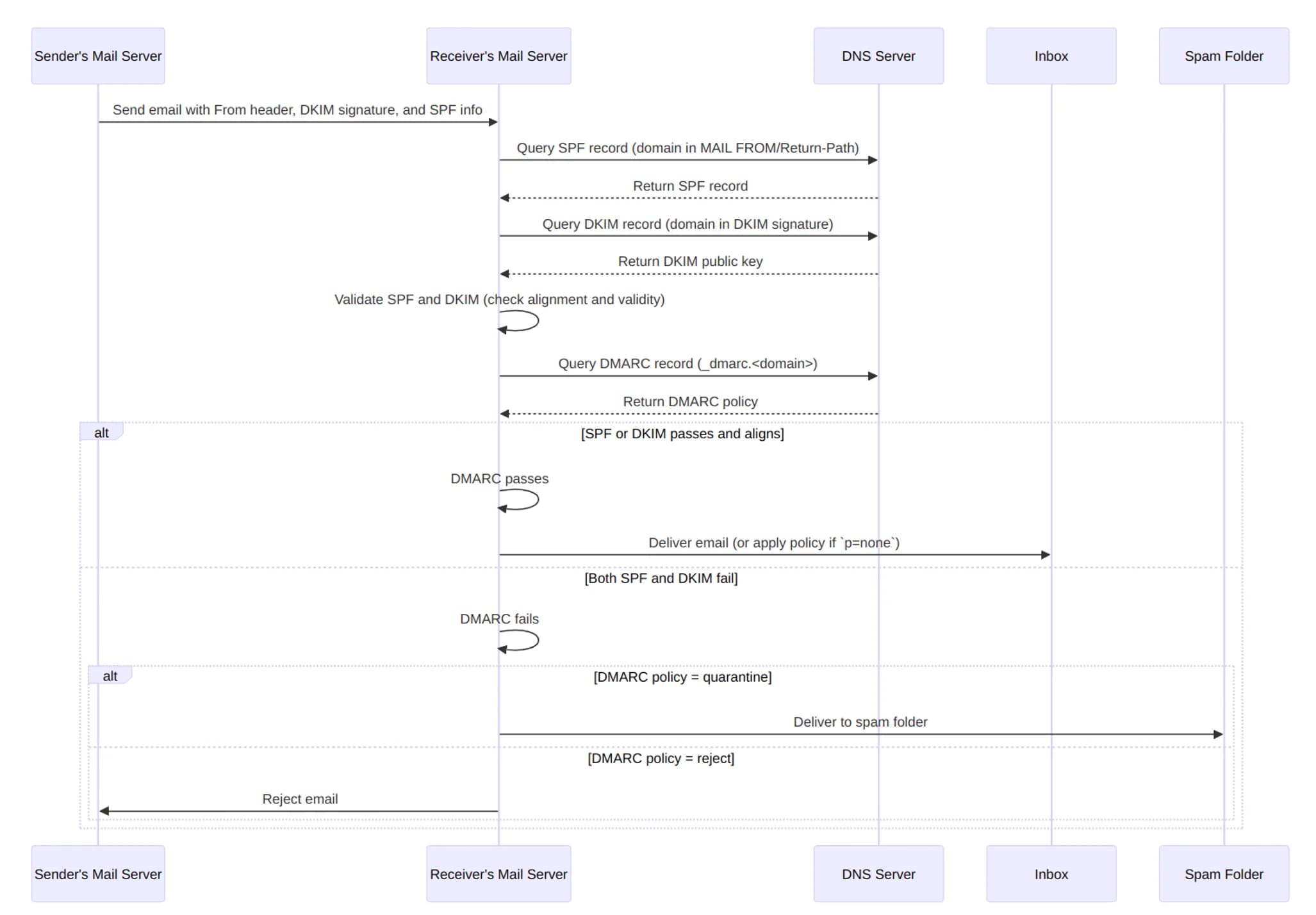
Signup verifications, password resets, order notifications — almost every vibe project needs transactional email on day one, yet most wire up a random SMTP and watch those emails die in spam. This guide covers why transactional and marketing mail must never share a channel, a Resend vs AWS SES vs Postmark decision tree with pricing, a hands-on SPF/DKIM/DMARC walkthrough on Cloudflare, a spam troubleshooting checklist, and the CAN-SPAM/GDPR baseline — with copy-paste DNS records and code.