Don't Lock Disabled Users Out: Accessibility (a11y) in Practice for Vibe-Coded Projects
AI-generated UI never presses Tab and never turns on a screen reader — accessibility failures are invisible inside its visual feedback loop. This hands-on guide gives you a P0/P1/P2 prioritized checklist, four copy-paste prompt templates, a 30-minute free audit routine, before/after fixes for 6 high-frequency code failures, and a pre-launch acceptance checklist.
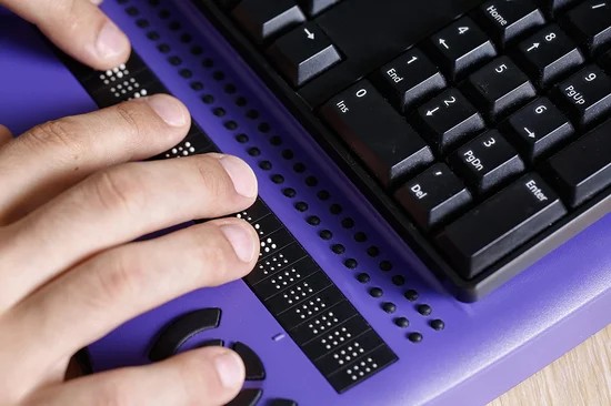
Your Product May Be Locking Some Users Out
Picture this: you spend two weeks vibe-coding a product with AI. It looks great, the animations are smooth, and everyone who tries it says they love it. Then one day, a user who operates their computer with only a keyboard opens it — they press Tab and the focus disappears to who-knows-where. A blind user opens a screen reader and hears a string of "button, button, button," with no idea what each button does. They're not "struggling to get used to it." They simply can't use it at all.
This isn't alarmism — it's a structural problem of the vibe-coding era: AI generates UI inside a purely visual feedback loop. It looks at screenshots, tweaks colors, adjusts layouts, but it will never press the Tab key once, and it will never turn on VoiceOver to hear what the page actually sounds like. Every quality dimension that requires non-visual verification is a blind spot in AI's workflow — and accessibility (a11y) sits squarely inside that blind spot.
My take: what AI programming skips isn't "details" — it's the fundamental question of whether an entire group of users can use your product at all. The good news is that most accessibility work is highly pattern-driven — semantic tags, focus management, contrast, keyboard paths — the same few dozen checkpoints over and over. That makes it a perfect fit for checklists, for prompts, and for a fixed step in your release process. That's what this guide is for: a prioritized checklist, copy-paste-ready prompt templates, a 30-minute audit routine, and the most common accessibility failures in AI-generated code with fixes.
One boundary up front: this isn't a translation of the full WCAG, and it doesn't replace testing with real disabled users. Its goal is practical — to let a solo developer zero out the most critical accessibility issues before launch.
Why AI-Generated UI Always Fails at Accessibility
Understand the cause before the cure. When AI writes frontend code, three systemic reasons guarantee accessibility debt:
First, its "eyes" only see screenshots. When you ask AI to change the UI, it looks at the rendered result: is it aligned, are the colors pleasing? A missing focus ring? Invisible in a screenshot. A garbled screen-reader reading order? Screenshots have no sound. A Tab order that jumps around? Screenshots are static. Every accessibility problem is invisible in visual feedback, so AI fixes exactly none of them.
Second, its training data is full of bad examples. Online tutorials, demo projects, and Q&A answers are full of <div onClick={...}> fake buttons, global * { outline: none } focus-ring removal, and placeholder-as-label patterns. AI learns "how most people write it," not "how to write it correctly," so it copies the bad habits straight into your project.
Third, "it runs" is not "it's usable." AI's definition of done is "the page renders and the feature works." Accessibility's definition of done is "it still works with a different input and output channel": keyboard only, audio only, high-contrast only. AI never runs the second kind of test, so there's always a gap between its "done" and your users' "usable."
Once you see these three points clearly, the conclusion follows: accessibility can't rely on AI "being conscientious" — you have to write the rules into your prompts and the checks into your process. AI is an extremely capable executor, but the checklist is yours to define.
P0: Fix Before Launch, or Don't Launch
These 7 items are the floor. Missing any one of them means some group of users fundamentally can't use your core features. Fix them in this order for the best return on effort.
1. Use semantic HTML — don't fake everything with divs
Buttons should be <button>, links <a>, navigation <nav>, main content <main>, headings h1–h6 in proper hierarchy. Semantic tags come with keyboard behavior and screen-reader semantics for free — a button is natively Tab-focusable, Space-activatable, and announced as "button"; a div onClick sounds like dead text to a screen reader and does nothing on keyboard. AI loves div fake buttons because they "look the same" — but "looks the same" and "works the same" are a universe apart. The fix: search your codebase for onClick and replace every one hanging off a div or span with a real button or anchor.
2. Focus must be visible — never nuke outline globally
Keyboard users rely on the focus ring to know where they are. A lot of AI-generated CSS hides * { outline: none; } — the default focus ring is ugly, so AI "helpfully" removes it everywhere. The result: the user presses Tab a dozen times, the page shows no reaction, and they assume the site froze. The correct approach is keeping a :focus-visible style: no ring on mouse click (visuals stay clean), a ring on keyboard Tab (usability preserved). This is the easiest P0 fix with the biggest impact.
3. Images that carry information need alt text
The rule is simple: informative images get descriptive alt (e.g., "Revenue trend chart, October 2026: rising from 20k to 80k"), purely decorative images get alt="" so screen readers skip them. AI tends toward two extremes: no alt anywhere so the reader just says "image, image," or alt text like "image 1" and "untitled." The fix: have AI list every <img> on the site and fill in alt one by one. Remember: alt describes the information the image conveys, not what the image looks like.
4. Hit contrast ratios — and never use color alone to convey information
Body text needs at least 4.5:1 contrast, large text at least 3:1. Light-gray text on white is AI's aesthetic disaster zone — "sophisticated" on a high-DPI designer screen, invisible on ordinary screens and to low-vision users. More insidious is color-only information: form errors shown only by turning the border red, charts distinguishing up from down only with red vs. green — colorblind users see a field of gray. The fix: pair errors with text and icons, pair status with color plus text or icons. Spot-check key color pairs with the WebAIM contrast checker — five minutes for a verdict.
5. Everything keyboard-reachable, no keyboard traps
Unplug the mouse and try completing your core flow — sign up, check out, publish — with only Tab, Shift+Tab, Enter, Space, Esc, and arrow keys. Dropdowns, date pickers, calendars, and rich-text editors are the danger zones: third-party components AI wires up are often keyboard-inoperable, or Tab goes in and never comes out (a keyboard trap). This is the most time-consuming P0 item, and the highest-value one: if the keyboard can't get through, screen-reader users, motor-impaired users, and even keyboard-loving power users are all locked out.
6. Every form control gets a label; errors get associated
Every input needs a <label> (or aria-label). Placeholder is not a label — it vanishes the moment the user types, and screen readers don't treat it as a label. Error messages should use aria-describedby to associate with the input, so screen-reader users hear what's wrong when the field receives focus. AI-generated forms are "naked input plus placeholder" nine times out of ten — expect to redo this one every time.
7. Add a "skip to main content" link
Put a visually-hidden-until-focused "Skip to main content" link at the top of the page, jumping straight to <main>. Keyboard users shouldn't have to Tab through the nav bar a dozen times to reach the content. It's about ten lines of code, dropped once into your Next.js layout. The cheapest fix with the strongest perceived benefit for keyboard users.
P1: Do These to Make It Genuinely Good
P0 makes it "usable"; P1 decides "how pleasant." It's mostly about ARIA patterns for three kinds of dynamic components — after these, the screen-reader experience goes from "tolerable" to "smooth":
Modals: dialog role plus focus trap
When a dialog opens, focus must move inside it, Tab must be trapped cycling within it, Esc must close it, and focus must return to the trigger button on close. AI-written modals usually only handle "show and hide" — focus stays behind on the page, and screen-reader users may not even know a dialog opened. See the code snippets later in this guide; start with role="dialog" aria-modal="true" and add focus management. Ideally mark background content inert or aria-hidden so screen readers ignore it while the dialog is open.
Tabs and dropdown menus: use standard ARIA patterns
Tabs use the tablist / tab / tabpanel role combination with arrow-key switching; menus use menu / menuitem. Don't invent your own div-plus-class "tab component" — screen readers recognize standard roles, not your class names. The MDN ARIA practices guide documents the full keyboard interaction for each pattern; copying it verbatim is the safest option — standard patterns are already supported by screen readers, so you don't have to teach users how yours works.
Toasts and async notifications: live regions
A "Saved successfully" or "Send failed" toast that's just a suddenly appearing div is completely invisible to screen-reader users. Wrap it in an aria-live="polite" live region and the reader announces content changes automatically. Mind the dosage: don't use alert-level assertiveness for "Saved successfully" — polite waits until the current reading finishes, assertive interrupts immediately. The former suits notifications; the latter is reserved for genuine emergencies. A screen full of assertive announcements is as annoying as a screen full of popups.
P2: Nice-to-Haves — Cheap to Add
- Respect reduced motion: use
@media (prefers-reduced-motion: reduce)to disable autoplay, large positional animations, and parallax. Vestibular-disorder users can get dizzy and nauseous from violent motion — this is physiology, not taste. The entrance animations and count-up effects AI loves adding just need a media-query wrapper — a few lines of CSS. - Touch targets big enough: tappable areas at least 44×44px. The 24px icons AI lays out with a desktop mindset are painful for phone users and motor-impaired users alike. Pad the hit area with padding; the visual size can stay the same.
- Screen-reader-only text: keep a
.sr-onlyutility class (visually hidden, screen-reader readable) to label icon-only buttons and summarize charts with data. Extremely cheap professionalism points — a few lines of shared CSS reused site-wide.
My take: you don't have to do all of P2 at once, but reduced motion is worth doing by default — a few lines of CSS, and a litmus test for whether your product has considered real human bodies.
Making AI Generate Accessible Code: Copy-Paste Prompt Templates
The key insight first: writing "please ensure accessibility" in a prompt is roughly the same as writing nothing — AI's understanding of "accessibility" is usually just sprinkling a few aria-labels around. You must write specific, verifiable rules. The four templates below can go straight into your project instructions or chat:
Template 1: Global constraints for UI generation (put in project instructions)
When generating any UI code, you MUST follow these accessibility rules:
1. Clickable elements may only be button or a. div/span onClick is forbidden.
2. Global outline: none is forbidden; keep a visible :focus-visible style.
3. Every input must have an associated label; placeholder is supplementary only.
4. Every img must have alt: informative images describe the information they convey, decorative images use alt="".
5. Text contrast: body text ≥4.5:1, large text ≥3:1.
6. State changes must never rely on color alone; pair with text or icons.
7. After generating, self-review: list the component's keyboard operation path and screen-reader reading order.
Rule 7 is the masterstroke: forcing AI to walk through the "keyboard plus screen reader" rehearsal itself often surfaces problems in the code it just wrote. Far less work than reviewing it yourself afterward.
Template 2: Retrofitting an existing component
Convert the component below into an accessible version. Requirements:
- Change div onClick into a semantic button, keeping the existing styles
- Add aria-label to icon-only buttons
- Ensure Tab reachability, Enter/Space activation, and visible focus
Only change accessibility-related parts; do not refactor business logic.
[Paste component code]
"Only change accessibility-related parts" is the insurance against AI's urge to refactor — in vibe projects, fixing one small thing must not break everything around it. The more specific the constraint, the better AI behaves.
Template 3: Generating a form
Generate a [sign-up/log-in/checkout] form. Requirements:
- Every field has a label; required fields say "required" in the label and use aria-required
- Validation errors are associated with their inputs via aria-describedby, with an icon in the error text
- On failed submit, move focus to the first field with an error
- The entire form must be completable with keyboard only
Template 4: Modal / drawer component
Generate a modal dialog component. Requirements:
- role="dialog" aria-modal="true", title associated via aria-labelledby
- On open, move focus inside and trap it (Tab cycles within); Esc closes
- On close, return focus to the trigger button
- Hide background content from screen readers (inert or aria-hidden)
Implement in React, with complete code.
One caveat: templates are a starting point, not a finish line. AI-generated code from these templates still goes through the 30-minute audit below — prompts reduce rework rates; they aren't an inspection exemption.
The 30-Minute Accessibility Audit: Free Tools, End to End
Reserve 30 minutes before launch and walk through this sequence. Every tool is free; you don't need to become an accessibility specialist.
Minutes 0–5: Lighthouse for direction
Run Lighthouse in Chrome DevTools with only the Accessibility category checked. The score isn't the point — the concrete issues are: images missing alt, low-contrast text, unlabeled form fields, each one a ready-made fix ticket. In my experience, AI-generated pages rarely score well on the first run; fixing the listed issues to reach 90+ is usually not hard.
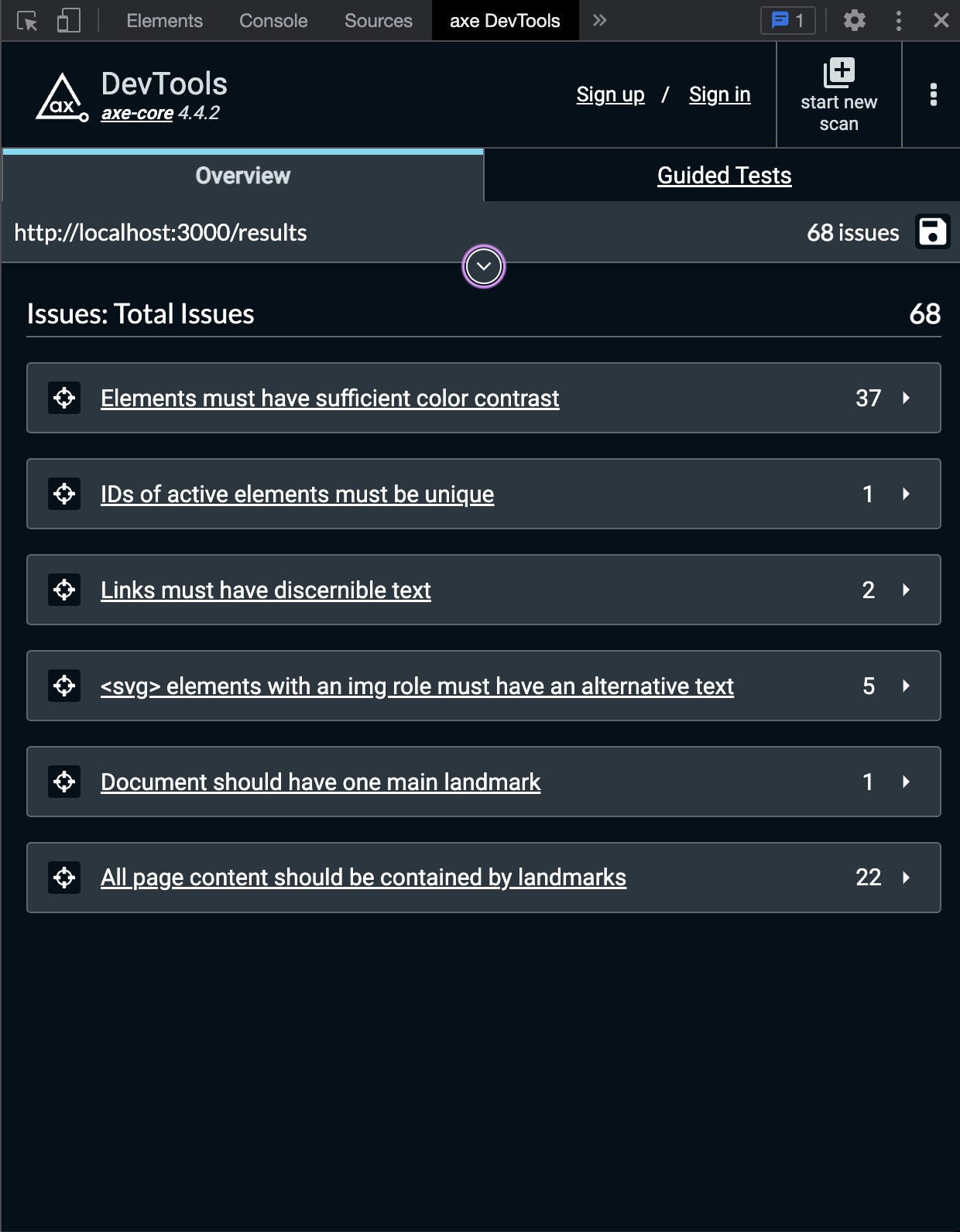
Minutes 5–15: axe DevTools for targeted cleanup
Install the axe DevTools browser extension (by Deque; the free tier is enough) and hit Scan on your core pages. It's more granular than Lighthouse — it catches "skipped heading levels," "duplicate ids," and "suspicious focus order." The rule: zero critical and serious issues; moderate ones at your discretion. One thing to keep in mind: automated tools can only catch the rule-checkable portion of issues — a long-standing consensus in the accessibility field — so the 15 minutes of manual work after this are non-negotiable.
Minutes 15–25: Unplug the mouse, keyboard-walk the core flow
These are the highest-value 10 minutes of the half hour. Check: does the Tab order match the visual order; can every button and link be reached and activated; can dialogs and menus be dismissed with Esc; are there traps Tab can't escape; is focus always visible? Walk your core paths — sign up, check out, publish content — and leave edge pages for later. If these 10 minutes go smoothly, your product already beats most vibe projects.
Minutes 25–30: Screen-reader smoke test
On Mac, press Cmd+F5 for VoiceOver; on Windows, install the free NVDA. No need to learn the full command set — Tab to move focus, arrow keys to read line by line, and the headings list are enough. The goals are clear: is the page title announced correctly, does every button have a name, can form errors be heard, where does focus go when a dialog opens? Hearing your own page read aloud for the first time surprises most people — that's exactly the value of these 5 minutes.
The routine in one line: tools find "what machines can find," the keyboard finds "broken flows," the screen reader finds "semantic disasters." The three complement each other; none is optional.
AI Code Fails, Live: Before / After
Below are the 6 highest-frequency accessibility failures in AI-generated code, each with its fix. All in React / Next.js, ready to use:
Fail 1: The div fake button
// ❌ Before: dead text to screen readers, inert on keyboard
<div className="btn" onClick={submit}>Publish</div>

// ✅ After: correct semantics, keyboard and screen reader pass
<button type="button" className="btn" onClick={submit}>Publish</button>
Fail 2: The nameless icon button
// ❌ Before: screen reader just says "button" — button for what?
<button onClick={close}><XIcon /></button>

// ✅ After: named, icon hidden from screen readers
<button onClick={close} aria-label="Close dialog">
  <XIcon aria-hidden="true" />
</button>
Note the aria-hidden="true" on the icon itself — otherwise the reader tries to pronounce meaningless characters from the SVG.
Fail 3: Nuking the focus ring globally
/* ❌ Before: keyboard users go "blind" */
* { outline: none; }

/* ✅ After: clean on mouse click, ringed on keyboard Tab */
:focus-visible {
  outline: 2px solid #2563eb;
  outline-offset: 2px;
}
Fail 4: Placeholder cosplaying as a label
// ❌ Before: hint vanishes on typing, ignored by screen readers
<input placeholder="Email address" />

// ✅ After: label association plus error association in one go
<label htmlFor="email">Email address (required)</label>
<input id="email" placeholder="name@example.com"
  aria-required="true" aria-describedby="email-err" />
<p id="email-err"><IconWarn />Please enter a valid email address</p>
Fail 5: The dialog that doesn't manage focus
// ❌ Before: dialog opens, Tab still wanders behind the page
{open && <div className="modal">...</div>}

// ✅ After: minimal viable focus management
const prevFocus = useRef(null);
useEffect(() => {
  if (!open) return;
  prevFocus.current = document.activeElement; // remember trigger
  dialogRef.current?.focus();                  // move focus in
  const onKey = (e) => e.key === 'Escape' && onClose();
  document.addEventListener('keydown', onKey);
  return () => {
    document.removeEventListener('keydown', onKey);
    prevFocus.current?.focus();                // return focus
  };
}, [open]);

<div ref={dialogRef} tabIndex={-1} role="dialog"
  aria-modal="true" aria-labelledby="dlg-title">...</div>
For production, my recommendation: use a component library with focus traps already handled — Radix UI, Headless UI — instead of hand-rolling your own trap. Focus-trap details run deeper than they look. When vibe-project time is tight, an accessibility-ready component library is the best-value choice.
Fail 6: The toast screen readers never hear
// ❌ Before: a div that pops up out of nowhere — screen-reader users miss it
{msg && <div className="toast">{msg}</div>}

// ✅ After: wrapped in a live region, changes get announced
<div aria-live="polite" role="status" className="toast-wrap">
  {msg && <div className="toast">{msg}</div>}
</div>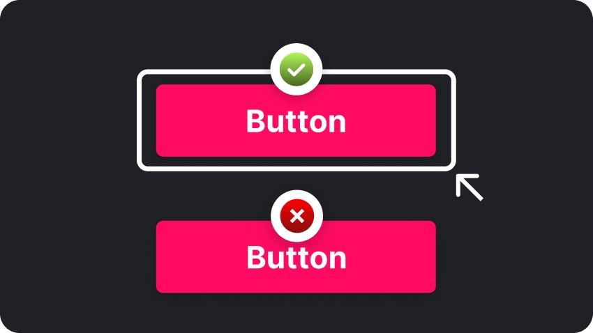
Pre-Launch Acceptance Checklist: Tick Every Box
Paste this table into your release checklist, right next to "tests pass." Tick every item before launch — no tick, no ship:
| Check | How to verify |
|---|---|
| No div/span fake buttons site-wide | Search for onClick globally; replace each one on a div/span |
| Focus ring always visible | Tab through once; focus location visible at all times |
| Image alt complete | axe scan shows no missing alt; decorative images alt="" |
| Text contrast passes | Key text 4.5:1, large text 3:1, spot-checks pass |
| Core flow works keyboard-only | Unplug the mouse; complete sign-up/checkout/publish |
| No keyboard traps | Tab gets in and out; dialogs close with Esc |
| Form labels everywhere | Every input has a label; errors audible to screen readers |
| Skip-to-content link | First Tab on the page skips past navigation |
| Dialog focus management | Focus moves in, Tab trapped, Esc closes, focus returns — all four |
| Toasts announced | aria-live wrapper; VoiceOver/NVDA announces notifications |
| Motion can be disabled | No autoplay or large motion under prefers-reduced-motion |
| Screen-reader smoke test passes | Listen through core pages; no parade of nameless "buttons" |
Closing: Accessibility Is the Litmus Test of Product Completeness
A judgment to close with. Many people treat accessibility as a "nice-to-have charity item," forever parked in "when we have time." But flip it around: is a product you can't even Tab through really "done"? The demo you vibe-coded in a day can impress friends; only the product that zeroes out the checklist above dares to call itself finished.
There's also a rarely mentioned bonus: accessibility work shares its beneficiaries with SEO and automated testing. Semantic HTML helps search engines understand your pages, keyboard operability makes E2E tests easier to write, and live regions force cleaner state management. Every bit of work you do for disabled users pays back into product quality in another form.
The AI era has driven the barrier to building products into the floor — but between "it runs" and "everyone can use it" lies exactly this checklist. Build it into your release process, as natural as running tests and reading error logs — next time before launch, spend 30 minutes walking through it, and your product will already be ahead of most vibe projects out there. This isn't sentimentality. It's professionalism.
Related articles
Great UX can't answer policy questions, error-message searches, or pre-purchase trust checks. This guide gives solo developers a shippable help-center methodology: a four-quadrant matrix for what to document, a 6-category IA template, writing skeletons for 6 article types, a three-stage AI-drafting workflow from your codebase, a minimal docs-as-code setup for one person, a release-tied doc-debt checklist, and a monthly 1-hour maintenance SOP.
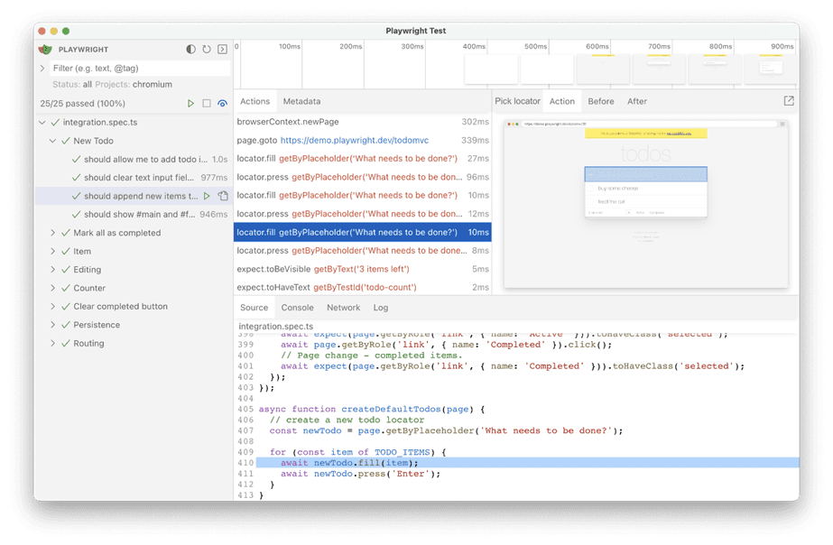
AI's biggest fear when editing code: fixing A breaks B. This execution-layer companion to our AI Testing Strategy shows solo developers how to build an E2E regression moat with Playwright, 5 golden paths, a data-testid convention, and GitHub Actions — one hour to set up, one hour a week to maintain, inside the free tier, with copy-ready code.

Model, prompt, or tool changes can silently break your agent while you're busy celebrating the fix. This guide shows how to build an eval harness from scratch: a 20-case golden set from real traffic, deterministic code scorers plus calibrated LLM judges, a three-layer scoring split, an anti-self-deception checklist, and a CI gate that actually blocks merges — closing the loop with production sampling and shadow runs.