The Ones Who Never Look at the Pricing Page Are Already Gone: Pricing and Paywall Design for Vibe Projects
A pricing field guide for solo and small-team vibe coding projects: three-tier anchoring and decoy effects that don't get you caught; where to draw the free/paid line (usage quota vs feature gates vs seats); no-card vs card-required trials with real numbers; the three right moments for a paywall and copy that converts; five signals your pricing is wrong; Stripe details the docs skip; plus copy-paste Next.js paywall code and a pre-launch checklist.
Let me start with a scene you might be living right now. You vibe-coded an AI resume optimizer in two weeks, launched on Product Hunt, collected 400+ signups. Google Analytics shows decent session times, the aha moment is real — someone tweeted that the rewritten resume actually landed them an interview. Then you open your Stripe dashboard: 0 payments. Not 1. Zero.
The problem is probably not the product. It's that you buried the act of asking for money too deep. The upgrade entry point hides three menus deep inside settings, the pricing page is only reachable from the footer, and the free quota stretches to 200 uses — users never get a chance to see the price, let alone a reason to pay. Everyone who never looks at the pricing page churns; flip it around and it reads: if users can't see the price, you effectively have no pricing.
This guide skips the MBA-slide version of "pricing strategy" and goes straight to the concrete questions that trap one-person or two-to-three-person teams shipping vibe-coded projects: how to lay out three pricing tiers, where to draw the line between free and paid, whether trials should require a card, when the paywall should appear, which metrics tell you the pricing is wrong, and the Stripe details the docs never warn you about. At the end, a copy-paste-ready Next.js paywall implementation.
The three blades of pricing psychology, applied to tiny projects
At big companies, pricing psychology comes out of A/B tests. For small projects, you just copy the conclusions. The good news: the conclusions are stable, and three of them are enough.
Blade one: anchoring — the most expensive tier isn't there to sell
In a three-tier layout, the top tier exists to make the middle tier look cheap. This isn't theory; it's been verified at checkout counters for decades: with three tiers, the middle one typically captures 55% to 65% of paying users. Drop to two tiers and the cheap one eats 80%+ of choices — because without a reference point, users can only pick "the one that doesn't hurt."
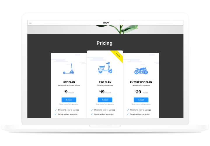
Here's a starter layout you can copy directly for a vibe project: $9 / $29 / $79, or in an RMB context ¥19 / ¥59 / ¥129. The $79 tier (call it Team, Scale, whatever) can be stuffed with features, generously. It will probably sell a handful of seats a month; its KPI is making $29 look like "just twenty bucks more for twice the stuff."
A counterintuitive judgment call: the most common pricing mistake for solo projects is almost always pricing too low, never too high. A $5/month product generates roughly the same support ticket volume as a $29/month product — users don't file fewer tickets just because it's cheap. But $5 attracts price-sensitive users whose churn runs 2–3x higher than $29 users, and they complain more. You're not saving your users money; you're saving your own life.
Blade two: the decoy effect — use feature decoys, not price decoys
The classic decoy looks like this: $29/month, $290/year, $349/year with priority support. The middle "$290/year" option is the decoy; it exists only to make $349 look like "59 bucks more for a pile of extras, what a deal," while making $29/month look "not savvy."
But in a small project, price decoys get spotted fast — you have a few hundred users, each sharp as a tack, and when they see a "deliberately bad middle tier" their first reaction isn't "wow, deal," it's "this author is playing me." The safer move is a feature decoy: the middle tier sits close to the low tier in price, but includes exactly one feature the user happens to want (say, "PDF export" or "API access"). The user feels like they figured it out, not like they were manipulated. Feeling manipulated is slow poison for a small product's reputation.
Blade three: the 9-ending — only works at low price points
The difference between $29 and $30 genuinely lifts conversion 3% to 8% at price points under $50 — the left-digit effect is real. But past $200 the rule flips: $299 looks like a promotion, $300 looks like "a serious service." For the Team tier shown to business buyers, round numbers read as professional and expensable.
So copy the whole playbook, not half of it: 9-endings on the low tiers ($9/$29), round numbers up top ($79/$300). Slapping 9-endings on every tier makes even the top tier feel like a street stall.
Where exactly to draw the line between free and paid
A free tier is where vibe projects burn money — note: burn, not spend. Every GPT-4o call your free users make, every image they generate, deducts directly from your API bill. Draw the line in the wrong place and you're paying people to leech off you.
There are three ways to draw that line. Which one to use isn't a matter of taste; it follows your cost structure:
| Approach | Fits products like | Typical shape | Fatal trap |
|---|---|---|---|
| Usage quota | Every use has a clear AI/compute cost | 100 generations or 1,000 credits per month | Quota too generous — users move in permanently |
| Feature gates | Tool-type products with near-zero marginal cost | Free tier can't export or use the API | Gating the wrong feature makes free unusable |
| Seats | Collaborative, multi-user products | Free from 3 seats up | Early solo projects have nobody to collaborate with |
The test is a single sentence: the free quota must let users touch the aha moment, but never let them move in. For an AI image tool, 20 free images are enough for a user to see "yeah, this quality is legit"; 200 images turns your free tier into their production pipeline. For a SaaS writing tool, 3 free deep rewrites get people hooked; unlimited free rewrites make you a charity.
There's a subtler trap: an oversized quota feeds more than users — it feeds scrapers and cloners. Your free API allowance is perfect fuel for someone "borrowing" your servers to build a competitor. Every quota design needs two locks: a daily cap (against burst abuse) and a signup bar (email verification at minimum — don't let scripts run wild).
Quotas and feature gates can stack, and that's the most common combo for small projects: free tier gets 100 credits a month and no HD export. Stacking gives users two reasons to pay: they ran out, and they want better. Offer only one reason and you're throwing away half your conversions.
Trials: card upfront or not — don't guess, look at the numbers
This is the most argued question in pricing design, but the data is actually blunt. The two routes perform roughly like this:
- Card required before trial: trial-to-paid conversion of 40% to 60% — beautiful. The price: your signup funnel loses 70% to 80% at the "enter credit card" step. You've filtered out everyone in "just looking" mode.
- No-card trial: 3 to 5 times the signups of the card route, but trial-to-paid lands at only 15% to 25%. The bottom of the funnel is full of tourists who use it and leave.
Choose based on what you're short on. Early solo projects are starved of a user base and feedback, not those first tens of dollars of MRR — go no-card, accumulate 500 trial users, convert 80 of them, and collect 200 pieces of feedback along the way. Once organic traffic stabilizes and your aha moment is strong enough (users go "wow" within 10 minutes), switch to card-required trials and keep the tourists out.
Trial length matters too. 14 days is industry inertia, but for most vibe tools 7 days is plenty — validating a tool's value doesn't take two weeks. 30-day trials are the worst option: users forget you by day 3, and when the "trial ending" email arrives on day 30 they stare at it blankly — the lowest conversion of all. Counterintuitive but real: shorter trials convert better. Urgency is free and outperforms any dunning copy you'll ever write.
One more detail: email users 3 days before the trial ends, and don't title it the bureaucratic "Your trial is ending." Write "You have 12 of your 100 credits left — they reset Thursday." Translating "ending" into a loss the user can feel changes open and conversion rates by an order of magnitude.
When the paywall pops: timing beats copy ten to one
A harsh ranking first: in paywall design, timing > trigger conditions > copy > visual design. The prettiest modal in the world converts at zero if it fires on the user's first day after signup. Get timing wrong and everything after is wasted.
The paywall belongs in three moments. Remember the mnemonic: after the high, at empty, at the gate.
- After the high — right after the user experiences the aha moment. In an AI resume tool, the user sees the rewritten resume, thinks "wow," and then you show "upgrade to save this resume" — conversion runs 3 to 5 times higher than a cold-start popup. The emotional peak is the willingness-to-pay peak. Don't waste it.
- At empty — the exact moment the free quota runs out. Note: the exact moment, not three days later. The user's 101st click on generate triggers "you've used your 100 monthly generations — upgrade to continue." That's a perfectly legitimate charge. Wait three days to send a reminder email and they've already moved to a competitor.
- At the gate — when the user voluntarily reaches for a paid feature. Clicking "Export PDF" and getting gated, clicking "API access" and getting gated — these users arrive at the paywall carrying clear intent, and they convert best. Pushing a paywall on someone who wasn't trying to do that thing isn't monetization; it's harassment.
Once timing is right, copy earns its keep. Copy has exactly one iron rule: translate "Upgrade to Pro" into what the user is doing right now. Compare: "Upgrade to Pro for unlimited generations" vs. "Generate image #101 — $29/month." The first is feature-listing from the product's perspective; the second is action-continuation from the user's perspective. In practice, action-oriented copy converts 30% to 50% better than feature-listing copy — because the user never has to mentally translate "what does this have to do with me."
Three more copy details that solo teams get wrong for years: first, put the price on the button ("Continue generating · $29/mo") — don't make users click through to discover the price; every extra hop bleeds ~20% of them. Second, make the annual discount instantly legible ("$29/mo, or $290/year — two months free"), never "17% off annual" which requires mental math. Third, the modal must have a close button, and don't show it again to the same user for 7 days after they close it — chasing people for money looks worse than not charging at all.
Five danger signals: your pricing is wrong
Pricing isn't done the day you launch; it's a data-reading job. Any two of these five signals mean your pricing is already wrong — don't hesitate, change it.
Signal one: pricing-page-to-signup conversion under 2%. Healthy small products sit at 3% to 8%. Under 2% means one of two things: the price scared people off, or the pricing page failed to explain "why this money is worth it." Don't rush to cut prices — rewrite the value story on the pricing page first. Often the problem isn't the number; it's the words next to the number.
Signal two: over 40% of paying users churn within 90 days. This isn't an acquisition problem; it's value misalignment — what users expected when they paid isn't what the product delivered. The usual cause is an over-generous free tier: after paying, users find "it's barely different from free" and leave next month. The fix runs in reverse: don't make paid better — cut free harder.
Signal three: half your support tickets ask "can it be cheaper" or "is there a free version." Your line is drawn in the wrong place — the core value users want is locked behind the paywall while the free tier offers things nobody cares about. The line should gate advanced usage, never core value. Lock the core value and users never even reach the aha moment.
Signal four: annual plans under 10% of subscriptions. Healthy subscription products see 20% to 40% annual. Under 10% means users don't trust you — not the product, but whether you'll still exist next year. The solo-founder fix is concrete: put a clear refund policy on the annual page ("30-day no-questions refund"). It outperforms any "limited-time offer." Trust is a small team's scarcest currency.
Signal five: upgrade rate near zero. Everyone buys the cheapest tier, nobody moves up. Your tiers have no "ladder feel" — users can't perceive the gap between the low and middle tiers. The fix isn't adding features; it's surfacing the middle tier's differentiators where users see them daily: every time a low-tier user exports, show "Pro users can export HD PDFs." Invisible value equals no value.
Stripe in practice: the pricing details the docs won't warn you about
Stripe's docs teach you the API calls; they don't teach you the mistakes. Here are the most common billing face-plants in small projects.
One tier, one Price object — never simulate tiers with coupons. Coupons are for promotions; tiers are for subscriptions. Mix them and your MRR reports and churn analysis turn to garbage, and year-end reconciliation will make you want to die. Monthly and annual are two separate Prices — don't compute "monthly × 12 × 0.8" dynamically in code; dynamic pricing means voluntarily giving up Stripe's invoicing, tax, and receipt capabilities. A Price is immutable once created, but you can always create a new one — that's exactly why it's designed immutable.
Metered billing sounds beautiful; small projects should stay away for now. It fits API-resale products, but "unpredictable bills" is the king of user complaints. Run fixed quotas for three months first; only consider metering once you know your usage distribution (where the median and P90 sit). Introducing metering too early just offloads pricing complexity onto the user.
Trial conversion isn't about trial_period_days — it's about the trial_will_end webhook. Set a 7-day trial when creating the subscription, and Stripe fires trial_will_end 3 days before it ends — that's the official, reliable moment to send your "credits remaining" reminder, far better than computing dates yourself. Two more events you must handle: checkout.session.completed (payment succeeded — activate the subscription, send the welcome email) and invoice.payment_failed (charge failed — grant a 7-day grace period before downgrading, never downgrade same-day; mistakenly cutting off one real user costs more than feeding freeloaders for a few extra days).
Debug locally with the Stripe CLI's test clocks — don't actually wait 7 days. stripe listen --forward-to localhost:3000/api/webhooks/stripe pipes events to your machine, and a test clock can fast-forward a subscription to "day 6 of trial" so you can walk the full chain: conversion, reminder, failed charge. Any project that ships without rehearsing this chain will wake someone up at 3 AM in its first month.
Below is a Next.js implementation you can copy: all pricing converges into one config file, the paywall is a standalone component that renders when the quota hits zero, and upgrades go through Stripe Checkout (no building payment pages yourself — PCI compliance is Stripe's problem).
// lib/pricing.ts — pricing is configuration, not magic numbers scattered in components
// Create the Product + Prices in the Stripe Dashboard first, then paste the price ids
export const PLANS = [
  {
    id: "starter",
    name: "Starter",
    priceId: "price_1S...", // Price id for $9/mo
    amount: 900,            // cents, for display
    credits: 100,           // monthly quota
    features: ["100 AI generations/mo", "SD export", "Email support"],
  },
  {
    id: "pro",
    name: "Pro",
    priceId: "price_1S...", // $29/mo
    amount: 2900,
    credits: 1000,
    highlighted: true,      // highlight the middle tier on the pricing page: anchoring, in code
    features: ["1,000 AI generations/mo", "HD PDF export", "API access", "Priority support"],
  },
  {
    id: "scale",
    name: "Scale",
    priceId: "price_1S...", // $79/mo: the anchor tier, fine if it barely sells
    amount: 7900,
    credits: 10000,
    features: ["10,000 AI generations/mo", "Team collaboration (5 seats)", "Dedicated support"],
  },
] as const;

export type PlanId = (typeof PLANS)[number]["id"];

// Free tier: enough quota to touch the aha moment, never enough to move in
export const FREE_CREDITS = 20;
export const TRIAL_DAYS = 7;
// components/PaywallGate.tsx — renders when quota hits zero, null otherwise
"use client";
import { useState } from "react";
import { PLANS } from "@/lib/pricing";
export function PaywallGate({
remaining,
actionLabel,
}: {
remaining: number;
actionLabel: string; // what the user is doing: "Generate image #101"
}) {
const [loading, setLoading] = useState(false);
if (remaining > 0) return null;
async function upgrade(planId: string) {
setLoading(true);
const res = await fetch("/api/checkout", {
method: "POST",
headers: { "Content-Type": "application/json" },
body: JSON.stringify({ planId }),
});
const { url } = await res.json();
window.location.href = url; // off to Stripe Checkout — never touch card numbers
}
return (
<div className="paywall">
<h3>Your free monthly quota is used up</h3>
<p>{actionLabel} — upgrade to continue. Cancel anytime.</p>
{PLANS.map((p) => (
<button key={p.id} onClick={() => upgrade(p.id)} disabled={loading}>
{p.highlighted ? "Most popular · " : ""}
{p.name} · ${(p.amount / 100).toFixed(0)}/mo
</button>
))}
</div>
);
}
// /api/checkout/route.ts does exactly one thing: look up the priceId by planId,
// create a Checkout Session with trial_period_days=TRIAL_DAYS —
// the middle ground between no-card and card-required trials:
// card on file, but nothing charged for 7 days.Pre-launch checklist: copy it and check it off
Twenty minutes before launch. Go through these 10 items one by one — miss any and your pricing page might as well not exist.
- Pricing page reachable in one click from the homepage, plus a footer link — don't make users treasure-hunt for prices.
- Three tiers, middle highlighted, top tier stuffed as the anchor.
- Price printed on the upgrade button ("$29/mo"), never hidden behind another click.
- Free quota validated with real humans: 3 new users walk the flow, confirming the quota just barely reaches the aha moment.
- Daily caps + email verification live — scripts can't drain your free quota.
- 7-day trial with an automatic "credits remaining" reminder 3 days before it ends (wired to trial_will_end).
- Paywall appears only in the three moments: after the high, at empty, at the gate. No payment popups on signup day.
- Modal has a close button; after closing, leave that user alone for 7 days.
- Annual discount instantly legible ("two months free"), refund policy stated plainly ("30-day no-questions refund").
- Webhooks fully wired: checkout.session.completed, trial_will_end, invoice.payment_failed (7-day grace), customer.subscription.deleted.
One honest closing note: pricing isn't a math problem; it's psychology plus bookkeeping. The psychology part is mostly covered above; the bookkeeping part requires you to open the Stripe dashboard once a month yourself — read the churn, the upgrades, and what support tickets are actually asking. Vibe coding lets one person build a product in two weeks, but "one person keeping a product alive" runs on pricing. The product is the ship; pricing is the sail. Don't build the ship and forget the sail.
Related articles

The Zephos team planted 16 launch-killer bugs in Notely, an agent-built Next.js + Supabase + Stripe notes app — two payment-related: unsigned webhooks accepted, pro granted from a self-declared client_reference_id. This guide turns those traps into a playbook: webhook signature verification, a server-side single source of truth, the subscription state machine, test clocks, and a launch checklist. Money logic must be hand-written or audited line by line.
Vibe coding ships fast — then feedback dies in scattered DMs and dead channels. This playbook builds a loop light enough for a solo dev: one main entry + one escape hatch, a 30-second submission rule, the fix/build/won't trichotomy, lightweight RICE scoring, changelog write-backs, a copy-paste three-sentence reply template, a 4-step bad-review protocol, and a 30-minute monthly review SOP — with a working feedback-widget + Discord webhook code sample.

Traffic is moving from the search box to the AI answer box. A vibe coder ships a product in a week — and nobody finds it. This guide turns the SEO fundamentals (sitemaps, JSON-LD, Core Web Vitals) and the new AI-discovery toolkit (llms.txt, per-page Markdown versions, FAQ schema, agent-readable pricing and API docs) into a shippable 30-day checklist. The core judgment: how well you document sets your product's ceiling in the agent economy.