Stop Flashbanging Your Users: Dark Mode and Theme Switching for Vibe Projects
AI-built dark mode fails three predictable ways: hardcoded colors, white flashes on toggle, system preference fighting explicit choice. The fix: semantic CSS variables as the single source of truth, Tailwind v4 @custom-variant wiring, a system/light/dark state machine, an inline <head> script killing SSR first-paint flash (Next.js specifics, quantified acceptance), plus images, canvas charts, iframe embeds, WCAG AA contrast sampling — and a 5-step migration SOP with an AI rewrite prompt.
This guide covers the engineering of theme switching, with a clear division of labor from two design guides on the site: vibe-project-i18n-guide (internationalization) is about "how one UI speaks many languages", vibe-project-rich-text-editor-guide (rich-text editors) is about "how content gets authored and typeset" — this guide says nothing about copy or layout, only about how color goes from hardcoded to a switchable system. See https://vibefix.work/en/explore/vibe-project-i18n-guide and https://vibefix.work/en/explore/vibe-project-rich-text-editor-guide.
It's 11pm. You just deployed your vibe project, turn off the lights, and open your phone to admire your work — the first screen flashes full-white, stabbing your eyes; you recover, tap the moon icon, the page flickers three times before going dark, and half the cards stubbornly stay white with light-gray text floating on them, unreadable. This isn't just your story: AI-built projects ship dark mode like this nine times out of ten. It's not that the AI can't write dark: — it's that its approach to theme switching is like everything else it writes: it looks like it works, but it's full of holes.
1. Why dark mode keeps breaking in vibe projects
Three classic failures. Count how many your project has.
Failure 1: Colors hardcoded, changing one color means touching 40 files
/* Typical AI-generated code: colors scattered across every component */
.card { background: #ffffff; color: #1a1a1a; }
.sidebar { background: #f5f5f5; }
.btn-primary { background: #4f46e5; }
/* Three months later you want dark mode: grep #fff, get 237 hits. Good luck. */
This is the deepest disease: color with zero abstraction, written raw into styles. A human-written project at least extracts a few variables along the way; AI-generated code is written "in parallel" per component, each self-contained, with #ffffff repeated across 40 files. Dark mode isn't "add a toggle" — it forces you to answer one question: for every colored surface on the page, what should it be in dark mode? Without an abstraction layer, you answer it 237 times; with one, a dozen times — at the token definitions.
Failure 2: Full-screen white flash on toggle — users think it's a bug
You tap the moon icon; the page goes white before going dark. Or worse: opening the site at night, the first paint is a white flash before dark mode kicks in. That's FOUC (Flash of Unstyled Content), and in theme switching it deserves a blunter name: flashbang. The cause is plain: when the browser paints, JS hasn't read the user's theme preference yet — it lives in localStorage, and the JS that reads localStorage runs after HTML parsing. The browser paints one frame in the default (light) theme, then JS belatedly switches to dark. On slow networks this lasts half a second or more — long enough to feel broken. Section 4 gives the cure; the takeaway now: theme resolution must happen before the first paint, not after hydration.
Failure 3: System preference fights the user's choice, and the choice never sticks
The AI's favorite logic: on load, read prefers-color-scheme and follow the system; when the user taps the toggle, write localStorage. Sounds fine — until the user wants "follow system again" and discovers there's no such option. Or the reverse: the user explicitly picked dark, then switched their OS to light, and the site mysteriously followed, because the "follow system" listener kept running and ignored the explicit choice. The state machine was never drawn: "never chose" and "chose light" are two completely different states, but in AI-generated code they look identical — both are "nothing in localStorage". The correct model has three states; see section 3.
One shared root cause: the AI treats "theme" as a styling problem, when it's actually a state-management problem. Color needs an abstraction layer (section 2), theme needs a state machine (section 3), first paint needs a timing guarantee (section 4).
2. Architecture: CSS variables (design tokens) are the only right answer
Conclusion first, then why every other road is a dead end: every color must pass through CSS variables, named semantically; switching themes = replacing the variables' values in bulk.
/* ✅ The right way: semantic tokens. Components reference semantics; themes define values */
:root {
  --bg-primary: #ffffff;
  --bg-secondary: #f5f5f5;
  --text-primary: #1a1a1a;
  --text-secondary: #6b7280;
  --border-default: #e5e7eb;
  --brand: #4f46e5;           /* brand color: usually unchanged across themes */
}
[data-theme="dark"] {
  --bg-primary: #0f172a;
  --bg-secondary: #1e293b;
  --text-primary: #f1f5f9;
  --text-secondary: #94a3b8;
  --border-default: #334155;
  --brand: #4f46e5;
}
.card { background: var(--bg-secondary); color: var(--text-primary); }
Naming: --bg-primary, not --gray-900
This is where AI-generated token systems most often go wrong. The AI loves naming by color value: --gray-900: #111827, and then in dark mode --gray-900 holds a light color — name and value fully decoupled, and nobody dares touch it six months later. The correct discipline is name by role, not by appearance: --bg-primary says "this is the main page background"; whether it's white in light mode or deep navy in dark is the theme's business. You can layer it further: primitive palettes (--slate-900) define "which colors exist", semantic tokens define "where each is used". When reviewing AI-generated code, enforce one rule: raw color values or direct primitive references in components get sent back.
Tailwind's trade-off: the dark: variant is fine, but pair it with @custom-variant
Tailwind users have two roads. Road one: keep using the dark: variant — class="bg-white dark:bg-slate-900". It's ergonomic in component libraries, but the cost is writing every color twice; miss one spot and you get failure #1's half-white cards. Road two: wire all Tailwind colors to CSS variables (bg-(--bg-primary) in v4, or map variables in the theme), so switching themes only touches [data-theme]. My recommendation: new projects go straight to CSS variables + data-theme, with Tailwind handling layout and spacing only; legacy projects already drowning in dark: should at least switch the variant's trigger from the default prefers-color-scheme to your data attribute — the Tailwind v4 docs give the canonical incantation:
/* app.css (Tailwind v4): make dark: follow your data-theme, not the OS */
@import "tailwindcss";
@custom-variant dark (&:where([data-theme=dark], [data-theme=dark] *));
What this line does: dark:bg-slate-900 no longer listens to the OS media query; it applies whenever an ancestor carries data-theme="dark". Without it, your JS toggles data-theme while Tailwind's dark: still listens to the OS — two sources of truth, i.e. failure #3 live on stage. The Tailwind docs' dark-mode page explicitly documents the three-way toggle (light / dark / system) recipe: custom variant + window.matchMedia to detect the OS preference — the same model as this guide's section 3 state machine, corroborating each other.
Two dead ends: hard-cutting two class sets, and filter: invert(1)
Dead end one: "two hardcoded class sets" — body.light .card{...} body.dark .card{...}, writing every component's styles twice. It's a hand-rolled poor man's version of CSS variables: variables are "define once, references follow automatically"; hard-cutting is "hand-write every reference twice". At component count N you will miss one, and the miss is a yin-yang face. Worse with third-party components: you can't patch a dark variant onto every class in node_modules.
Dead end two: "filter: invert(1) one-click dark mode" — slap an invert filter on html and light becomes dark. Stunning in demos, miserable in production: photos get inverted (portraits become negatives), brand colors turn unrecognizable (your brand blue becomes swamp yellow), box-shadow and gradients break, and the whole page repaints through a GPU filter. Its only legitimate use is an accessibility fallback for "force dark", not your theme implementation. The litmus test: any solution that lets you dodge the question "what should each surface be in dark mode" is just deferring the debt.
3. The three-state model: system / light / dark
The theme state machine has exactly three states, but AI-generated code usually implements two (light/dark) and hand-waves "follow system" as an initial default — that's the root of failure #3. The diagram below is this guide's core model; implement it as drawn:
/media/content-media/a56f3ccd-38fe-490f-a5d3-6edb6bc228d5/2026/10/e789172f-aca6-4f21-b214-8587bb953ec1.png
Three key points:
- Explicit user choice always overrides the OS preference. Once the user has tapped the toggle, the
matchMedia('(prefers-color-scheme: dark)')listener has exactly one job: do nothing. AI-generated code commonly gets this wrong — the listener runs unconditionally, so a user who picked dark watches the page flip when they switch their OS to light, and concludes "my setting didn't save". - "Never chose" is a state of its own. Store three values:
'light' | 'dark' | null(null = follow system), not a boolean. Code built onisDark: booleancan't express "follow system" at all, so it grows a second booleanfollowSystem, and two booleans compose into four states — one of them illegal. That's how state explosions start. - Clearing the explicit choice returns to follow-system. The theme switcher UI offers three options (Light / Dark / System), not a single toggle. Apple, GitHub, and Vercel settings pages all use three options for a reason: a toggle has two states and can't express a three-state model.
Where to persist: localStorage vs cookie
This is an architecture-level decision; get it wrong and section 4's cure is void:
- localStorage: client-only. The SSR server has no idea what theme the user wants. First paint must render a default, then JS corrects it — the source of the white flash. Fine for pure client-rendered SPAs, where first paint waits for JS anyway.
- cookie: travels with every request, so SSR can write the correct
data-themeinto the<html>tag while rendering HTML — first paint right the first time, zero flash. Costs a few dozen bytes per request, plus one API call (or JS-written cookie + refresh) when the user switches themes.
The decision is simple: SSR frameworks (Next.js / Nuxt / SvelteKit) → cookie; otherwise → localStorage. A hybrid works too: cookie for the server, localStorage for client JS, write both on switch. But don't store only in localStorage and then complain that SSR flashes — that was your choice.
// Three-state hook (React): null = follow system
import { useEffect, useState } from 'react';

export type Theme = 'light' | 'dark' | null;

export function useTheme() {
  const [theme, setTheme] = useState<Theme>(null);

  useEffect(() => {
    const saved = document.cookie.match(/(?:^|; )theme=(light|dark)/)?.[1]
      ?? localStorage.getItem('theme');
    setTheme(saved === 'light' || saved === 'dark' ? saved : null);
  }, []);

  const apply = (t: Theme) => {
    setTheme(t);
    const resolved = t ?? (matchMedia('(prefers-color-scheme: dark)').matches ? 'dark' : 'light');
    document.documentElement.dataset.theme = resolved;
    // cookie for SSR (30 days), localStorage for client JS
    document.cookie = `theme=${t ?? ''}; path=/; max-age=${30 * 86400}`;
    if (t) localStorage.setItem('theme', t); else localStorage.removeItem('theme');
  };
  return { theme, apply };
}
4. Killing SSR hydration flash: the inline script is the only cure
Section 2 fixed "how colors are organized", section 3 fixed "how state is stored"; this section fixes "how first paint doesn't flash". The blunt truth first: any scheme that reads the theme after React hydration is doomed to flash — hydration happens after first paint by definition, so what would correct the frame that's already on screen? The only cure is resolving the theme during HTML parsing, before the first paint. Put an inline script in <head> that runs blocking: read preference → write data-theme → then the browser paints. It must be inline (not an external JS file — external files wait for download), it must be short (it blocks parsing; dozens of lines max), and it must come before all styles.
<!-- top of <head> in layout.tsx / index.html: runs blocking, theme set before paint -->
<script>
(function () {
  try {
    // 1. Explicit choice wins (cookie for SSR, localStorage fallback for pure CSR)
    var m = document.cookie.match(/(?:^|; )theme=(light|dark)/);
    var t = (m && m[1]) || localStorage.getItem('theme');
    // 2. Only consult the OS when there's no explicit choice
    if (!t) t = matchMedia('(prefers-color-scheme: dark)').matches ? 'dark' : 'light';
    // 3. Write it before the browser's first paint; CSS hits the right variables immediately
    document.documentElement.dataset.theme = t;
  } catch (e) { /* storage disabled (private mode): keep default light, don't throw */ }
})();
</script>
Three practical details for Next.js App Router: first, this script belongs in the <head> of app/layout.tsx, inlined via dangerouslySetInnerHTML (it's a string, skipped by the bundler — an external file would be slower). Second, with the cookie approach, server components can read the cookie and write data-theme directly on the <html> tag; the inline script then degrades to "client-side correction" for the edge case where the user changed themes in another tab. Third, add suppressHydrationWarning on the <html> tag — the server-rendered data-theme and the client-computed one can disagree at the boundary (e.g. server had no cookie and rendered the default); without it React logs a hydration mismatch warning. Note this is warning-level: attribute mismatch won't re-render the whole tree. Don't "fix" the warning by moving theme logic back behind hydration — that's curing the symptom by reintroducing the disease.
Someone will ask: why not just use next-themes? You can — internally it does exactly this (ThemeProvider + an inline anti-flash script). But know what it does for you, or you'll stare blankly when it breaks: its attribute="class" mode writes a class on <html>, defaultTheme="system" maps to this guide's three-state model, enableSystem maps to the matchMedia listener. Fine for a solo team, provided its default (localStorage persistence) matches your architecture decision — SSR projects should configure it to read the cookie or accept its "first paint follows the system" compromise.
The timing diagram below contrasts the two schemes — the left is what you have now, the right is what it looks like fixed:
/media/content-media/a56f3ccd-38fe-490f-a5d3-6edb6bc228d5/2026/10/04d20569-62ae-41c1-b109-90639a0a32a4.png
Acceptance must be quantified, not "feels flash-free": Chrome DevTools → Performance, record one refresh (dark preference + Slow 3G throttling); the paint events on the timeline should show exactly one dark frame. Then hard-refresh three times with cache disabled in the Network panel: zero white flashes to the naked eye. Put this in your release checklist — theme flashing is the kind of bug you think you fixed until a user on a different network reproduces it. Unquantified fixes don't count.
5. Deep water: images, charts, third-party embeds
Color system built, first paint flash-free — now the real deep water begins: not everything on the page obeys CSS variables.
Images: picture + source, with one trap
<!-- light / dark variants of the same logo -->
<picture>
  <source srcset="/logo-dark.svg" media="(prefers-color-scheme: dark)" />
  <img src="/logo-light.svg" alt="logo" />
</picture>
The trap: media="(prefers-color-scheme: dark)" follows the OS preference only, not the user's explicit choice. A user on a light OS who manually picked your dark theme still gets the light logo — a yin-yang face. The real fix is JS-driven: watch your theme state and swap the img's src (or rewrite the picture's media dynamically). The cheaper architectural decision: make logos and icons SVG with currentColor wherever possible — one file serves both themes, reserving dual variants for photos and screenshots that can't be vectorized. Every image variant you don't maintain is a failure point you don't have.
Charts: canvas doesn't eat CSS; repaints are on you
Canvas charts (ECharts, Chart.js) bake colors into pixels; they don't notice when CSS variables change. Standard practice: wire chart palettes to your tokens too — read them via getComputedStyle(document.documentElement).getPropertyValue('--text-secondary'), and on theme switch call chart.setOption / chart.update() to repaint. Don't hardcode two palettes in JS — that voids the token system you built in section 2: chart colors should read tokens, not constitute a second token system.
Third-party embeds: iframes are sovereignty-free zones
Embedded Disqus threads, YouTube players, Twitter cards run in cross-origin iframes — your CSS can't reach in. Three layers of defense: first, check whether the embed supports a theme parameter (YouTube's theme=dark, Giscus's data-theme) and sync it with your theme state; second, put color-scheme: dark on the iframe's container — a standard CSS property telling the browser "render native controls dark here", covering scrollbars, form controls, and selection color in Chrome/Firefox/Safari; third, for embeds with no support, frame them in a dark rounded container — visual quarantine, acknowledging the sovereignty-free zone. Remember to declare color-scheme on both :root and [data-theme="dark"]; don't leave color-scheme: dark lingering in light mode, or your light pages get black scrollbars, which is worse.
Contrast: dark mode isn't "just dim the text"
The AI's favorite dark-mode move: body text #ffffff too harsh? Dim it to #9ca3af. Dim too far and you cross WCAG's red line. WCAG 2.1 Success Criterion 1.4.3 (Contrast Minimum) is a hard standard: body text vs background needs at least 4.5:1; large text (18pt / 14pt bold and up) needs 3:1 for AA — numbers written into W3C's Understanding docs, not suggestions. Dark mode's most common casualty is secondary text and placeholders: #6b7280 on #111827 is roughly 4.6:1 — barely passing; one shade lighter and it fails. The sampling method: per theme, grab five categories — body, secondary, button text, placeholder, disabled — and run each through a contrast calculator (Chrome DevTools' color picker shows the ratio directly; two clicks). Skip full automation — 200 automated "warnings" is a list you'll never read; five-category sampling catches 95% of real problems. One piece of trivia: contrast is about luminance, not hue — red on green passes AA if the luminance gap is big enough. So "use colorful accents liberally in dark mode" is safe; don't let intuition fool you.
6. Migration SOP: 5 steps from hardcoded colors to tokens
If your project is failure #1's crime scene right now (237 #fffs), don't "refactor when there's time" — follow these 5 steps; a medium project fits in an afternoon:
Step 1: Scan and inventory. Grep all hex / rgb / hsl values, sort by occurrence count. Colors appearing 10+ times are 99% token material; ones appearing once or twice — note them, don't touch yet. They're probably a specific illustration's palette, and forcing them into tokens pollutes semantics.
Step 2: Build the token table. Following section 2's semantic naming, map high-frequency colors to --bg-* / --text-* / --border-* / --brand semantic tokens, and define the dark values at the same time (don't "do dark later" — later means never). Brand and status colors (success/warning/error) are usually theme-agnostic; reuse directly.
Step 3: AI batch rewrite. Feed the AI the prompt below (adapt the parenthesized parts), replacing file by file. Three non-negotiable constraints:
Replace all hardcoded color values under (src/components) with CSS variable
references. Rules:
1. Only replace "interface colors" (backgrounds/text/borders/shadow colors).
   Never touch color values inside SVG illustrations, image URLs, or third-party
   component overrides — touching those is an incident;
2. Mapping: #ffffff→var(--bg-primary), #f5f5f5→var(--bg-secondary),
   #1a1a1a→var(--text-primary), #6b7280→var(--text-secondary),
   #e5e7eb→var(--border-default)... (paste the full table from step 2);
3. Change at most 5 files at a time; show me git diff after each batch and
   wait for confirmation before continuing. For any color not in the mapping
   table, STOP and ask me — never invent a variable name.
Step 4: Regression check. Tick every item before merging:
- ✓ Grep
#-prefixed hex: 0 remaining in component styles (SVG illustration internals excepted) - ✓ Switch through light / dark / system one by one; eyeball core pages; no yin-yang faces
- ✓ Dark preference + Slow 3G, three hard refreshes, 0 white flashes (section 4's acceptance bar)
- ✓ Five-category contrast sampling (section 5), run once per theme
- ✓ Theme switch on chart pages: canvas repaints with correct colors
- ✓ Third-party embeds (comments/video) visually contained or theme-parameterized
Step 5: Delete dead colors, add a gate. Once clean, delete unused legacy variables; add one CI rule: new hex values in component style files raise a warning (color-no-hex in stylelint or a custom grep hook both work). Migration is one-off; the gate stops the AI from hardcoding colors again next time it one-shots a feature — half of maintaining a vibe project is preventing the AI's relapses.
7. One-sentence summary
Dark mode isn't "a second set of styles" — it's three things: colors through semantic CSS variables (section 2), theme through the system/light/dark three-state machine (section 3), first-paint resolution before the first paint (section 4). Each kills one class of failure; miss any one and your site will flashbang someone at night sooner or later. Related reading: i18n is more than translation: internationalization for vibe projects (one UI, many languages), rich-text editor selection and rollout (how content gets authored and typeset) — copy and layout are theirs; color and theme are this guide's.
Comments (0)
Related articles
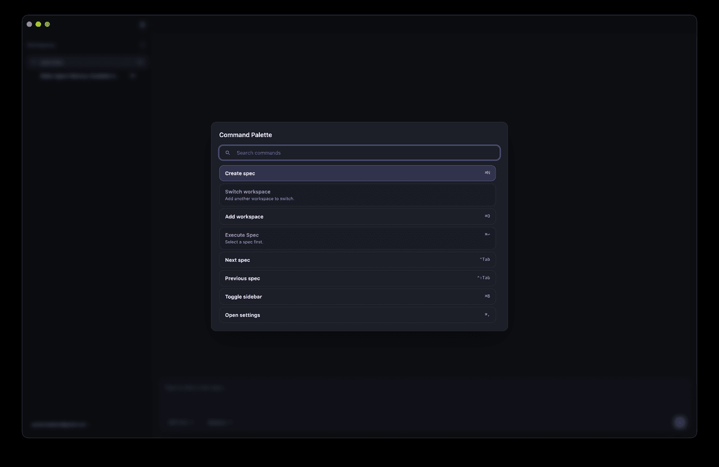
AI can ship a Cmd+K palette in half an hour, but match ranking, shortcut conflicts, IME flicker, and mobile degradation are where it breaks. This hands-on guide gives solo teams the full route: a command registry data model, a five-stage fuzzy scoring pipeline, a global shortcut system with conflict detection, the complete keyboard accessibility loop, mobile entry degradation, permission-linked commands, and a 10-item launch checklist.
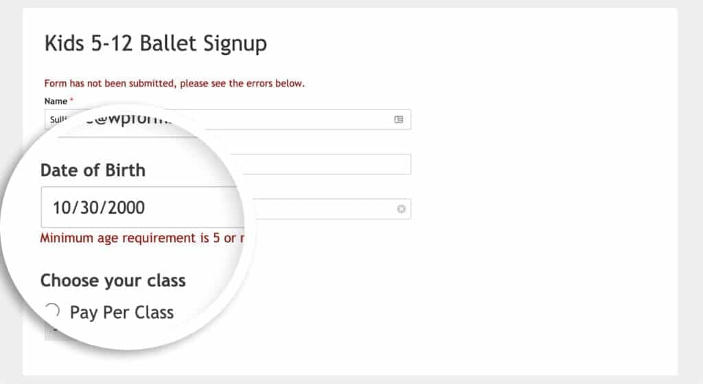
Every vibe project is full of forms, and AI-generated ones only stack `required` attributes — vague copy, async races, double submits, and lost drafts are where users bleed away. This hands-on guide gives solo teams the full practice: the three validation layers, error-copy rewriting, debounced race-safe async checks, the idle/submitting/success/error state machine with a triple double-submit guard, file-bearing forms, multi-step drafts, accessibility, and a 12-item launch checklist.
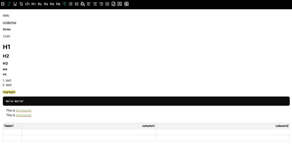
AI can demo a rich text editor in 200 lines, but paste sanitization, mobile keyboards, and Markdown round-trips are where the real pits hide. This hands-on guide gives solo teams a complete route: a four-axis Tiptap/BlockNote scorecard, the store-JSON/export-Markdown combo, Next.js SSR hydration fixes, a whitelist paste-sanitization pipeline, direct-to-storage image uploads, and a 10-item pre-launch checklist.