The Power User's Front Door: Command Palette (Cmd+K) in Practice for Vibe Projects
AI can ship a Cmd+K palette in half an hour, but match ranking, shortcut conflicts, IME flicker, and mobile degradation are where it breaks. This hands-on guide gives solo teams the full route: a command registry data model, a five-stage fuzzy scoring pipeline, a global shortcut system with conflict detection, the complete keyboard accessibility loop, mobile entry degradation, permission-linked commands, and a 10-item launch checklist.
Scope note: This guide is about the in-app command execution entry point, with a clear division of labor from three related guides: vibe-project-search-guide (site search) covers "searching content: docs, products, users" — this guide covers "searching actions: jumping to pages, running commands, invoking features." Fundamentally different things being searched. vibe-project-accessibility-a11y-guide (accessibility) covers "site-wide accessibility methodology" — Section 5 here applies its keyboard-audit method to this one component. vibe-project-onboarding-design-guide (onboarding) serves "first-time visitors"; the command palette serves "the users who stay and use it daily" — opposite ends of the journey.
Ask AI to add a "press Cmd+K to open a command palette" to your vibe project and it delivers in half an hour: a frosted-glass modal, an input, a few rows of text — looks exactly like Linear in the demo. You nod and ship. Then a user types "d" looking for Dashboard and Delete project ranks first; someone typing in a Chinese IME watches the candidate list flicker wildly; Mac users press ⌘K and nothing happens — because your listener only checked e.ctrlKey; mobile users can't find the entry at all, because you only built a keyboard shortcut. The command palette is the watershed between a SaaS that "works" and one that "works well" — and the component AI is most likely to make "look done": its pitfalls aren't in the modal styling but in match ranking, shortcut conflicts, the accessibility loop, and mobile degradation. This guide gives solo teams a hands-on route: when it's worth building, how to register commands, how to get fuzzy matching right, how to keep shortcuts from fighting, how to close the accessibility loop, where it lives on phones, how it ties into permissions, and what to check before launch — all landing in copy-pasteable code and checklists.
1. When It's Worth Building: Three Signals, Two Anti-Signals
A command palette isn't for every project. Start with arithmetic: count the "executable actions" in your product — page jumps, creates, exports, toggles, settings. Anything the user must click to do counts.
Three signals it's worth it
- More than ~15 actions; navigation is bursting. Top nav plus sidebar gracefully holds about 10 entries; beyond that you start hiding menus and nesting accordions. A command palette's value is that "entry count is no longer layout-bound" — the 16th feature and the 60th cost the same to ship: one registered command.
- Keyboard-heavy users. Admin tools, dev tools, ops tools — users live in them for hours a day. Linear, Notion, GitHub, VS Code all have command palettes; that's no coincidence. Power users stay for "hands never leave the keyboard."
- Features are multiplying fast. The signature of vibe projects is AI adding five features a week. The palette is a shock absorber for feature bloat: a new feature gets an entry point the moment it's registered as a command, no nav redesign required.
Two anti-signals: don't build it yet
- Content-consumption products. Users mostly read articles, watch videos, browse goods; executable actions are few. That product needs search (searching content), not a command palette (searching actions). Revisit the scope note above if the line is blurry.
- Mobile-first. There's no Cmd+K on phones, so discovery cost is brutal. Section 6 covers degradation — but if 80% of your users are on phones, polish the bottom nav first.
One-line decision: actions > 15 and mostly desktop users → build; otherwise spend the time on navigation and search.
2. The Command Registry: Don't Hardcode Commands in Components
AI's first draft of a command palette usually looks like this: a hardcoded array inside the modal component, { title: "New project", action: () => router.push("/new") }. It runs — and three months later you pay: adding permission control means touching the component; i18n means titles scattered everywhere; "which command is most used" has nowhere to start.
The right shape is a command registry: commands are data, not JSX. Define the data structure first:
// lib/commands/types.ts — one definition, reused everywhere
export interface CommandDef {
  id: string;              // stable id for analytics & shortcut binding; survives renames
  title: string;           // display title (via i18n)
  keywords: string[];      // aliases: words users might search, e.g. "export" for 导出
  group: "navigate" | "action" | "settings" | "help";
  shortcut?: string;       // e.g. "mod+k" — display only; registration logic lives elsewhere
  when?: (ctx: CommandContext) => boolean;  // contextual condition
  requiresPermission?: string;               // permission gate, see Section 7
  run: (ctx: CommandContext) => void | Promise<void>;
}

export interface CommandContext {
  pathname: string;
  projectId?: string;
  can: (permission: string) => boolean;  // reuses the RBAC predicate
}

// lib/commands/registry.ts
const registry = new Map<string, CommandDef>();
export function registerCommand(cmd: CommandDef) {
  if (registry.has(cmd.id)) {
    console.warn(`[commands] duplicate id: ${cmd.id}`);
    return;
  }
  registry.set(cmd.id, cmd);
}
// The palette only ever sees "commands available right now"
export function getAvailableCommands(ctx: CommandContext): CommandDef[] {
  return [...registry.values()].filter(
    (c) => (!c.when || c.when(ctx)) && (!c.requiresPermission || ctx.can(c.requiresPermission))
  );
}
The registry pays off four ways at once: tests can assert when conditions without rendering UI; i18n only touches title keys; analytics gets stable ids for free; rollouts can be driven by server-side command flags without code changes. Example of a contextual command:
// only appears on project detail pages
registerCommand({
  id: "project.archive",
  title: "Archive current project",
  keywords: ["archive", "close project"],
  group: "action",
  when: (ctx) => ctx.pathname.startsWith("/projects/"),
  requiresPermission: "project:archive",
  run: async (ctx) => { await archiveProject(ctx.projectId!); },
});
One iron rule: the list the palette renders always comes from getAvailableCommands(ctx), never from the raw registry. Context filtering and permission filtering are the same gate — don't re-implement ifs in the UI layer.
3. Fuzzy Matching in Practice: Why includes Filtering Feels Broken
AI's favorite matching logic is items.filter(i => i.title.includes(query)). Three fatal flaws: no ranking ("d" matches both Dashboard and Delete project — first place goes to whoever's earlier in the array), no tolerance (one typo in "dashbord" yields zero results), no layering (an obscure settings command ties with the nav item you open 20 times a day). Three failed searches and the palette is dead to that user forever.
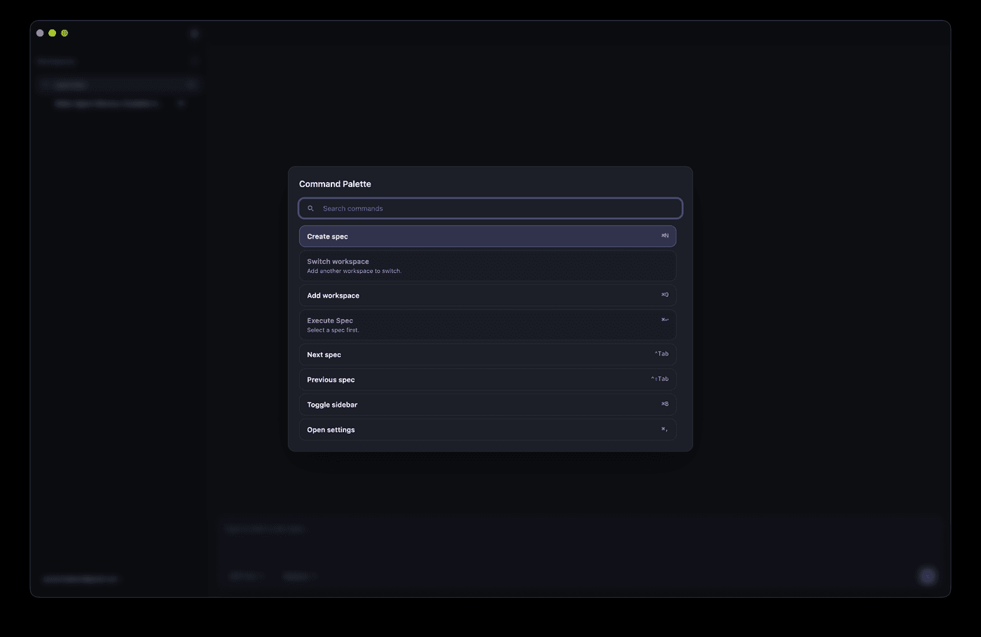
 Screenshot of a command palette UI: search box, command list, and keyboard shortcut hints on the right
A production-grade match is a five-stage pipeline (diagram above) built around one scoring formula: final score = match score × group weight + recency bonus. Layer by layer:
Layer 1: match score (how "alike" is computed)
Replace includes with subsequence matching, scored by hit position:
// lib/commands/match.ts — simplified scorer, ready to use
export function scoreMatch(text: string, query: string): number {
  const t = text.toLowerCase(), q = query.toLowerCase().trim();
  if (!q) return 0;
  if (t === q) return 100;                    // exact match
  if (t.startsWith(q)) return 80;             // prefix hit
  // initialism: "np" matches "New Project"
  const initials = t.split(/[\s_-]+/).map(w => w[0]).join("");
  if (initials.startsWith(q)) return 60;
  // plain subsequence: chars in order; tighter = higher score
  let ti = 0, gaps = 0;
  for (const ch of q) {
    const idx = t.indexOf(ch, ti);
    if (idx === -1) return 0;
    gaps += idx - ti; ti = idx + 1;
  }
  return Math.max(1, 40 - gaps);              // wider gaps, lower score
}
Aliases should participate too: concatenate title + keywords.join(" ") into one long string before scoring, so searching "export" finds a command whose keyword list contains it.
Layer 2: group weight (what matters more)
At equal match scores, navigation commands should outrank settings — a user searching "users" wants the user list page (opened 20× a day), not user settings (touched monthly). Give each group a coefficient: navigate 1.2, action 1.1, help 1.0, settings 0.9. Keep coefficients in a config table, not inside the sort function, so you can tune them against analytics later.
Layer 3: recency bonus (frecency)
VS Code's palette feels smarter the more you use it because it remembers your habits. Implementation is simple: after a command runs successfully, write { id, at: Date.now() } to localStorage (keep the last 50), and add 20 points at sort time for anything used within 48 hours. But cap it: the bonus must never exceed one match-score tier, or "I clicked Delete project once" will pin it to the top forever — a disaster.
Bonus for Chinese-language products: pinyin initials
Chinese command titles ("新建项目") may be searched by pinyin initials ("xjxm"). Approach: precompute each title's initial string with a pinyin library at registration time and append it to the matchable string. Skip it if your product is English-only.
Library choice: cmdk's status in 2026
Verified 2026-10-16: cmdk (pacocoursey/cmdk) version 1.1.1 (released 2025-03-14, MIT) is still the choice real community projects made in 2026 — a public architecture decision record dated 2026-09-01 shows a new project evaluating and adopting it, with React 19 inside its peer range. Its headless design (behavior plus data-cmdk-* attributes, styling is yours) remains its biggest strength. But know the other side: long-standing issues — async items losing selection, diacritics not normalized (café ≠ cafe), IME input triggering search prematurely — are still on its issue list, and in 2026 community members started rewriting a framework-agnostic headless core to fix them architecturally. Conclusion: usable, but don't expect it to do Section 3's scoring pipeline for you — its default ranking is weak, so pass your own scoreMatch via the filter prop. Whether to adopt it, and at which version, should follow npm and the repo's activity at the time.
4. The Shortcut System: Global Registration and Conflict Avoidance
A command palette's soul is "one keystroke away." The shortcut system has three jobs: register, yield, display.
Global registration: only listen for modified combos
// hooks/useCommandPaletteHotkey.ts
useEffect(() => {
  const down = (e: KeyboardEvent) => {
    // mod+k: ⌘K on Mac, Ctrl+K on Win/Linux
    if ((e.metaKey || e.ctrlKey) && e.key.toLowerCase() === "k") {
      e.preventDefault();
      setOpen((v) => !v);
    }
  };
  document.addEventListener("keydown", down);
  return () => document.removeEventListener("keydown", down);
}, []);
Two details: e.key.toLowerCase() handles caps lock; preventDefault is mandatory or the browser's default (e.g. Chrome's search box) wins.
Yielding inside inputs
One rule: single-key shortcuts (like "/" to focus search) must yield to text inputs. Gate the handler:
const tag = (e.target as HTMLElement)?.tagName;
const isTyping = tag === "INPUT" || tag === "TEXTAREA" ||
  (e.target as HTMLElement)?.isContentEditable;
if (isTyping && !e.metaKey && !e.ctrlKey) return; // typing: single-key shortcuts stand down
Modified combos are unaffected — ⌘K inside an input still opens the palette, which is the expected behavior.
Mac/Windows glyph display
The shortcut hint at the right of each command row shows ⌘K on Mac, Ctrl+K on Windows. Translate at render time:
const isMac = navigator.platform.toUpperCase().includes("MAC");
const label = shortcut.replace("mod", isMac ? "⌘" : "Ctrl");
// "mod+k" → "⌘K" on Mac, "Ctrl+K" on Win
Write mod in the registry; translate in the view layer — the precondition for one registry serving both platforms.
The shortcut conflict registry
As features grow, feature A's mod+shift+p will eventually collide with feature B's. Keep a registry and check it automatically in dev:
// lib/commands/shortcuts.ts — every shortcut registered here
export const SHORTCUTS = {
  "commandPalette.toggle": "mod+k",
  "project.create": "mod+shift+n",
  "search.focus": "/",
} as const;
// fail fast in dev on duplicates
const seen = new Map<string, string>();
for (const [id, key] of Object.entries(SHORTCUTS)) {
  const norm = key.toLowerCase();
  if (seen.has(norm)) throw new Error(`[shortcuts] conflict: ${id} vs ${seen.get(norm)} on "${key}"`);
  seen.set(norm, id);
}
Desktop apps (Electron/Tauri) register global shortcuts through native APIs — a separate mechanism from the in-page set, and they don't interfere. Follow the Electron/Tauri official docs for that; out of scope here.
5. Accessibility: Closing the Keyboard-Navigation Loop
The palette's users are precisely the people most dependent on keyboards — accessibility isn't a bonus, it's the bar. Apply the keyboard-audit method from vibe-project-accessibility-a11y-guide to this one component: unplug the mouse and complete "open palette → type → arrow through results → Enter to run → Esc to close" using only the keyboard. Any step that sticks blocks launch.
- Semantics: modal container
role="dialog" aria-modal="true"; inputrole="combobox" aria-expanded aria-controls="cmdk-list"; listrole="listbox"; itemsrole="option" aria-selected. The highlighted item is exposed viaaria-activedescendantpointing at the current option's id — that's what lets screen readers announce which row you're on. - Key loop: Esc closes (and returns focus to where it was); ↑/↓ move the highlight (wrapping at ends); Enter runs the highlighted item; Home/End jump to the extremes. Mind CJK IMEs: don't re-filter between
compositionstartandcompositionend, or the list flickers with every pinyin keystroke — a long-standing cmdk issue to handle in your own implementation. - Focus management: move focus to the input on open; restore it to the trigger on close (record
document.activeElement). Use a battle-tested focus-trap library rather than hand-rolling Tab containment. - Empty results must be announced too: give the empty area
role="status"so assistive tech announces "no matching results" instead of silence.
Record the full flow on video during the audit — that's your regression baseline for every future change to the palette.
6. Mobile Degradation: Where It Lives When There's No Cmd+K
On phones there's no ⌘K, so the "one keystroke away" advantage drops to zero. But the "search actions" need remains: users still want to jump somewhere fast. Degradation options, ranked:
- First choice: a "Search" entry in the bottom nav. Ship the palette as a full-screen search page entered from the bottom tab. Mobile users have muscle memory for "bottom tab = primary function" — the most discoverable option. Behind it sits the same
getAvailableCommandslist: registry reused, layout swapped for mobile. - Second choice: a persistent top search bar. For hybrid content+action apps (think Notion mobile), a top search box opens a search page with "Actions / Content" tabs.
- Don't: gestures as the only entry. Two-finger swipes and three-finger taps are nearly undiscoverable. Fine as easter eggs, never as the primary entry.
Three hard requirements for the mobile list: tap targets ≥ 44px; virtualize beyond ~200 commands (phone memory can't take thousands of DOM nodes); sticky group headers for long-list orientation. For gesture and layout specifics, follow the site's mobile UX checklist.
7. Commands as API: Tying Into Permissions
The palette and the permission system are a natural pair — Section 2's getAvailableCommands already bakes requiresPermission filtering into the query layer. The product decision to make: for commands the user can't run, hide or show-disabled?
- Default: hide. A regular member never sees "Delete workspace," so there's no "why can't I click it" confusion, and the exposed surface is smaller (cleaner security-wise).
- Exception: disabled with explanation. Upgrade-nudge scenarios — "Export data (Pro)" greyed out with a label — are conversion touchpoints. Each one deserves product review; never the default.
Reuse the RBAC guide's predicate: ctx.can(permission) is the same function the permission system uses — the palette invents no second permission logic. The server must authorize the underlying APIs anyway — hiding in the panel is UI only; the real security boundary is always the backend.
One level further: treat the command palette as the product's "second API." Every command's run is independently callable: automation scripts can call it, tests can call it, a future public platform could expose it. Design the registry well and the palette, the shortcuts, and the public API become three skins over one capability inventory.
8. Launch Checklist: 10 Items
Check each one; all green before launch:
- 1. Bundle budget: palette code-split and lazy-loaded, < 30KB gzipped, excluded from the first-paint bundle. If it's over, check whether the whole icon library got bundled.
- 2. Empty state: no-match shows explicit copy ("No commands match "xxx"") plus a suggestion ("try searching settings, or press Esc") — never a blank panel.
- 3. Discoverability analytics: track open rate = palette-opening UV / total UV. Below 5% means the entry is buried — consider a first-run tooltip.
- 4. Shortcut conflict check passes: Section 4's registry reports zero errors on dev boot.
- 5. Keyboard audit passes: the Section 5 "unplug the mouse" flow, recorded and archived.
- 6. Permission filtering correct: log in as an unprivileged account — zero sensitive commands visible; unit-test
getAvailableCommandsdirectly. - 7. Mobile entry works: on a real device, the bottom-tab / top-search entry opens, the list scrolls, no horizontal overflow.
- 8. Recency is clearable: the
localStoragefrecency log has a "clear" affordance (settings page or small print at the panel bottom) — shared computers shouldn't leak habits. - 9. Large lists don't jank: generate 2,000 commands; typing must not drop frames; virtualize rendering beyond ~200 rows.
- 10. Execution errors are contained: when a command's
runthrows, the panel toasts + reports instead of white-screening. Wrappingrunin try/catch is three lines — don't skip it.
One last note: the command palette is a "gets better with use" component — launch is the starting line. Monthly, review the analytics: open rate, top-10 commands, zero-result queries. Zero-result queries are the best source of new-command ideas: what users tried to find but couldn't is exactly what you should register next release.
Comments (0)
Related articles
Every vibe project is full of forms, and AI-generated ones only stack `required` attributes — vague copy, async races, double submits, and lost drafts are where users bleed away. This hands-on guide gives solo teams the full practice: the three validation layers, error-copy rewriting, debounced race-safe async checks, the idle/submitting/success/error state machine with a triple double-submit guard, file-bearing forms, multi-step drafts, accessibility, and a 12-item launch checklist.
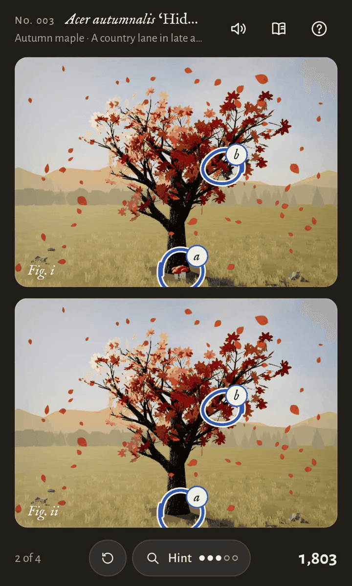
On October 14, Simon Willison sent one prompt to Claude Opus 5.5 Max from the iPhone Claude app's chat mode; 3 hours 7 minutes of single-pass reasoning later, out came a playable cozy spot-the-difference game with music, animation, and achievements. His verdict: telling the model to "make sure it is fun" works "uncomfortably well".
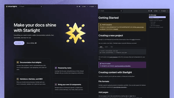
AI can slap together a page that looks like docs, but information architecture, versioning, search, and staying in sync with code are what make a docs site usable. This guide gives solo teams the full route: the README/help-center/docs-site decision table, a verified four-way tool comparison (Fumadocs/Starlight/Docusaurus/Mintlify), the four-block IA with two reader paths, snapshot versioning, DocSearch vs local search, OpenAPI-driven API reference, and a 10-item launch checklist.