Half Your Traffic Is on Phones: The Mobile Experience Checklist for Vibe Projects
Agents make your site gorgeous on a 27-inch monitor — then users open it on phones: buttons too small to tap, forms that break when the keyboard appears, layouts blown out by horizontal scroll. Mobile isn't a shrunken desktop; it's a different interaction language. This checklist covers touch targets, viewport and zoom, form keyboards, performance budgets, PWA installability, and the mobile-first acceptance phrases that get agents to ship it right.

What does your site look like on a phone? Answer honestly
Try an experiment: pull out your phone and open that project you recently vibed out. Not on Wi-Fi — on cellular data. Watch three moments: how many seconds did first paint take? Could your thumb hit the biggest button on the first try? When filling a form, did the keyboard push the submit button out of sight?
If any of those made you wince — welcome to the reality of most vibe projects. Agents work in desktop viewports by default: they lay out, debug, and screenshot at 1440px wide, everything perfect. But half or more of your users may open the link on a phone — links forwarded in chats, feeds, and groups land in mobile browsers. Desktop-perfect plus mobile-broken is the most common source of "invisible bad reviews" for vibe projects: users never tell you, they just close the tab.
Mobile isn't "desktop shrunk down"; it's a different interaction language: touch instead of mouse, metered data instead of broadband, constant interruption instead of focused browsing. This is a mobile-experience checklist written for vibe coders, in order — touch → viewport → forms → performance → PWA → acceptance workflow — fixing the agent's desktop bias one item at a time.
Touch: fingers aren't mice
A mouse clicks with 1-pixel precision; a fingertip needs 44×44 pixels minimum — the minimum touch target both Apple and Google agree on. Agent-generated interfaces routinely make three mistakes:
Mistake one: tiny, crowded buttons. Six 28px-tall text links crammed in a nav bar — precise with hover on desktop, two-at-once with a thumb on mobile. Fix: minimum 44×44px per tappable element, at least 8px between adjacent tappables. Small-looking icon buttons are fine — pad the hit area out; 24px visually with a 48px hit zone is standard practice.
Mistake two: hover dependence. "Delete button appears on hover," "tooltip on hover" — phones have no hover; long-press and swipe are the gesture language. Every hover-triggered critical action needs a mobile alternative: delete buttons always visible, tooltips become tap-to-expand. Have the agent check: with the mouse unplugged, can the core flow still complete?
Mistake three: gesture conflicts. A horizontally swiping card carousel plus a global swipe-to-go-back — users trying to swipe the card exit the page instead. Mobile gestures are scarce: one page, one primary gesture; don't let carousels, drawers, and back-swipes fight. When the agent pulls in a gesture library, ask: "does this conflict with the browser's default gestures?"
One more thumb rule: put core actions in the lower half of the screen. Phones are held one-handed; the thumb's comfort zone is the bottom two-thirds. Sticking the highest-frequency button ("publish," "submit," "play") in the top nav is desktop thinking; a bottom fixed action bar is mobile thinking.
Viewport and zoom: three lines of meta decide everything
At least a third of mobile bugs are viewport misconfiguration. First, make sure your HTML head contains:
<meta name="viewport" content="width=device-width, initial-scale=1"> — without it, mobile browsers pretend to be 980px-wide desktops and shrink your page into a blob users must pinch-zoom. You can still find this bug in vibe projects in 2026 — don't laugh; some agent-generated landing templates genuinely omit it.
Mind the second half: never add maximum-scale=1, user-scalable=no. Some templates disable zoom to "prevent double-tap zoom" — a direct accessibility violation; low-vision users can't enlarge text, and iOS dings you in accessibility review. Fix double-tap zoom with touch-action: manipulation: kills the 300ms tap delay while preserving the user's right to zoom.
Then horizontal overflow: some element wider than 100vw lets the page wobble sideways — one of the ugliest mobile bugs there is. Detection: swipe sideways on a phone; wobble means overflow. On desktop, scan DevTools with document.querySelectorAll('*') for elements where scrollWidth > innerWidth. Usual suspects: fixed-width tables, white-space: nowrap long text, negative-margin decorations. Fix: wrap tables in a horizontal scroll container (overflow-x: auto), let long text wrap or truncate.
The 100vh trap deserves its own mention: mobile browser chrome expands and contracts, so height: 100vh on iOS Safari routinely hides content behind the bar or leaves weird gaps. Use 100dvh (dynamic viewport height) instead — the browser adjusts automatically as chrome resizes. Agents rarely volunteer this newer unit; mention it once and it remembers.
Forms: the life-or-death line of mobile conversion
If your vibe project has any form at all — signup, login, checkout, search — this section decides conversion. Phone keyboards are small and clumsy; forms are where user frustration peaks.
One, summon the right keyboard. Phone fields get inputmode="numeric" for the number pad, email gets type="email" for the @-key layout, search gets type="search". Agents default everything to type="text", forcing users to switch keyboards three times to type a phone number — every switch is a churn opportunity. The cheapest optimization there is, one attribute.
Two, the keyboard pushing layout up. The keyboard eats half the screen; if your submit button sits underneath it, users finish the form and can't find submit — they assume it's frozen. Fix: flexible layouts on form pages, submit buttons inside the visible area or as a fixed bar above the keyboard; on iOS handle visualViewport changes too. Test method: tap through every field on a real device and check the submit button stays reachable.
Three, autofill and autocapitalization. Add autocomplete="email" / tel / name so browsers fill saved info automatically; on iOS add autocapitalize="off" autocorrect="off" to non-prose inputs, or the first letter of an email gets capitalized and login fails — an absurdly subtle bug that has genuinely happened countless times.
Four, one screen, one job. Desktops can hold 8 fields in two columns; mobile goes vertical, grouped, stepped. Splitting long forms into steps (3–5 fields each) with a progress indicator often doubles conversion. The agent's "one giant form screen" is a churn machine on phones.
Performance budgets: doing the math for 4G and mid-range phones
The performance guide covered general optimization; mobile needs its own math: your target user might be on 4G with a three-year-old mid-range Android. Quantified budget: first-screen JS under 170KB gzipped (one more cut below the desktop number), LCP under 2.5s measured at Moto-G-class hardware on slow 4G (that's what Lighthouse's mobile preset means), images generated at 800px wide for mobile (don't serve phones the 1920px hero).
Three mobile-specific optimizations: one, responsive images.srcset / sizes let the browser pick by screen width — 800px for phones, 1600px for desktops. next/image does this automatically; hand-written <img> gets no free pass. Two, cut desktop-only effects. Big background videos, complex canvas animations, parallax scrolling — a battery-drain-heat-lag trifecta on phones. Use the prefers-reduced-motion media query to downgrade animation: saves battery and respects motion-sensitive users. Three, slim fonts again. CJK fonts run several MB; on mobile go "webfont (subsetted) for headings, system fonts for body," per the font section of the performance guide.
Don't test only in Chrome DevTools device emulation — emulators don't do real CPU throttling or network jitter. Get a used old Android (the two-hundred-bucks kind); it's your most honest performance advisor.
PWA: giving your site "install" superpowers
Many vibe projects never need the App Store — PWAs (Progressive Web Apps) give a site "install to home screen, run fullscreen, work offline" powers for the cost of a manifest file plus a service worker.
manifest.json declares the app name, icons (both 512×512 and 192×192), theme color, display mode (display: standalone drops the browser chrome). Service workers handle caching strategy: precache the app shell (HTML/CSS/JS frame), network-first with cache fallback for content. Next.js has next-pwa, Vite has vite-plugin-pwa — each a plugin away.
Should you bother? Will users come back repeatedly (tools, journals, dashboards — yes; one-off marketing pages — no)? Need offline-ish availability (subway reading, outdoor use — yes)? Two no's, skip it; one yes, and PWA ROI is high. Note iOS PWA support has improved a lot in recent years (push notifications since 16.4) — don't use "iOS can't" as an excuse anymore; check current support before deciding.
Acceptance workflow: getting agents to ship mobile-first
Finally, the workflow. Hoping someone hand-tests on a phone every time isn't realistic — build mobile acceptance into the agent's workflow:
One, declare it in requirements. Start tasks with: "Mobile-first: design at 390px wide first, then scale up to desktop; every interaction must work without hover." The agent's layout thinking changes completely — mobile-first then desktop saves half the rework versus desktop-first then fixing mobile.
Two, screenshot acceptance. After every UI change, have the agent capture three screenshots with Playwright mobile emulation (devices['iPhone 14'] / 'Pixel 7'): 390px homepage, form page, landscape. One line of Playwright config, and 80% of mobile bugs surface before commit. Eyeball the screenshots yourself — one human glance beats a hundred assertions.
Three, real-device spot checks. Before each release, walk this on a real phone: □ first paint visible within 3s on 4G □ every button thumb-tappable □ full form flow completes □ no sideways wobble □ keyboard never covers submit □ core features work on weak signal (subway/elevator). Six items, ten minutes.
Ultimately, mobile experience is a mirror: it reflects not a technical problem but whether you thought about the user. The agent wrote the code for you, but thinking about the user is a standard only you can set. Paste this checklist into your project's AGENTS.md — next time the agent delivers, it'll check on a phone first itself. It doesn't have a phone, but it has Playwright, and you have a real device.
Related articles

Every vibe project hits the same moment: a list page firing a dozen DB queries per load, the database melting under modest traffic. This guide starts from the three-question caching mindset, then layers HTTP cache headers, Next.js data caching, Redis application caching with key design and the penetration/breakdown/avalanche defenses, and AI result caching (semantic cache, prompt caching), plus invalidation strategy and a launch checklist.
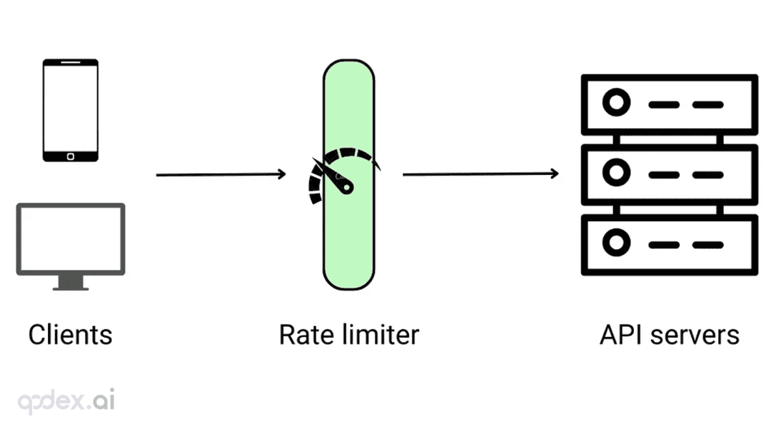
Every public endpoint will be called beyond your expectations some night. This guide builds a one-person-team rate-limiting system: algorithm choice (sliding window vs token bucket), four-layer defense, AI-endpoint money-burning protection, quota design, 429 response conventions, false-positive triage, and a launch checklist.
Every vibe project has the same darkly comic moment: your site goes white-screen and a friend tells you before your monitoring does. This guide builds a one-person-team error monitoring system: a 5-minute Sentry loop, error boundaries, report context design, backend structured logging, AI-call-specific protection, alert tiers, and a launch checklist.